App development for kids: big ideas into small hands

App development for kids means building software for an audience that cannot always read the fine print, tap precisely, or tell a friendly interface from a manipulative one. Good app development for kids starts from that reality: simple screens, forgiving interactions, real accessibility, and tight limits on what data ever gets collected about a child. It is less about flashy features and more about earning trust from two audiences at once, the child using the app and the parent or educator responsible for them.
This guide walks through what a kids’ app commonly needs, the design principles that hold up once real children start tapping around, and a build path we use inside Sticklight to ship a kid-facing web experience alongside a separate dashboard for the adults supervising it.
- App development for kids has to put safety, privacy, and accessibility ahead of features, every time.
- Interfaces for young users work best when they are simple, forgiving of mistakes, and light on reading.
- Any data collected about a minor needs a narrow scope, a lawful basis, and a proper legal review before launch, not after.
- A parent or educator dashboard should sit outside the child’s experience, with its own login and its own data boundary.
- The Accessibility Skill in Sticklight ships WCAG-aligned markup, focus states, and ARIA by default, which matters even more for young or neurodivergent users.
- A prompt gets you a working first draft fast. Refining on the canvas is where the real safety and usability work happens.
What app development for kids means today
App development for kids covers a wide range of products: learning apps, reading companions, homework helpers, course portals for young students, family organizing tools, and games built around an educational goal rather than pure engagement. What ties them together is not the subject matter, it is the audience. A six-year-old and a twelve-year-old read, tap, and reason differently from an adult, and often differently from each other.
That means every build has at least two audiences to satisfy at once: the child who uses the app, and the parent, guardian, or educator who chose it and stays accountable for what it does with the child’s information. An app that only optimizes for the child and ignores the adult’s need for visibility is not finished, even if it looks polished.
Why safety, privacy, and accessibility have to lead the build
For most software, safety and accessibility are treated as quality bars to hit before launch. For kids’ apps, they are the starting brief. Children have less context to spot a dark pattern, less ability to read a permission prompt critically, and, depending on age, a legal status that limits what they can consent to at all.
Accessibility carries the same weight. Kids’ apps are used by children with a wide range of vision, motor control, reading levels, and attention spans, often before anyone has diagnosed a need or requested an accommodation. Building accessibly from the first screen means fewer children get locked out simply because nobody asked what they needed.
What a kids’ app commonly needs
Across the products we see educators, parents, and course creators build, the same requirements show up again and again, regardless of subject matter.
- A simple, forgiving interface: few choices per screen, clear back and exit paths, and no penalty for tapping the wrong thing.
- Strong accessibility support: readable type sizes, real color contrast, screen reader labels, and controls that work without fine motor precision.
- Parental or educator controls: visibility into what the child is doing, the ability to set limits, and a way to pause or reset the experience.
- Careful handling of any data about the child: names, ages, school details, and behavior data are all sensitive, and collecting them without a clear reason and a legal review is a risk, not a shortcut.
Design principles that suit young users
Once the requirements are clear, the design choices tend to follow a consistent pattern. None of these are exotic, they are just easy to skip when a team is moving fast.
- Large touch targets and generous spacing, so small or imprecise taps still land correctly.
- Icons paired with short words rather than icons or text alone, since reading level varies widely by age.
- No infinite scroll, no variable reward loops, and no countdown timers designed to pressure a decision.
- Consistent navigation in the same place on every screen, so a child does not have to relearn the app each session.
- Immediate, kind feedback on mistakes, framed as “try again” rather than as failure.
The best test of a kids’ interface is not whether an adult finds it charming. It is whether a child can recover from a wrong tap without asking for help.
Handling data about children the right way
Data about minors sits under some of the strictest privacy rules in software, and those rules vary by country and by the age of the child. Collecting a birthdate, a school name, a location, or anything that could identify a specific child is a decision that needs a clear purpose, a minimal footprint, and sign-off from someone qualified to review it, rather than a product choice made in passing.
In practice, that means asking whether each piece of data is actually necessary before it is collected, avoiding behavioral tracking or ad targeting aimed at children, and building consent flows around the parent or guardian rather than the child wherever possible. None of this is legal advice, and it is not a substitute for a proper legal review before any kids’ product that touches personal data goes live.
A build path in Sticklight: web experience plus a parent or educator dashboard
When we build a kids’ product in Sticklight, we treat it as two connected builds rather than one screen with an admin mode bolted on. The flow follows Sticklight’s usual pillars, prompt, build, and publish, applied twice with a clear boundary in between.
- Prompt the kid-facing experience first, describing the age range, the reading level, and the core task, whether that is a lesson, a game, or a simple tool.
- Add the Accessibility Skill during the build step, so the generated markup starts with proper focus states, ARIA, and structure instead of having accessibility patched in afterward.
- Refine on the canvas: adjust wording to match the reading level, widen touch targets, simplify color contrast, and remove anything that reads as pressure or urgency.
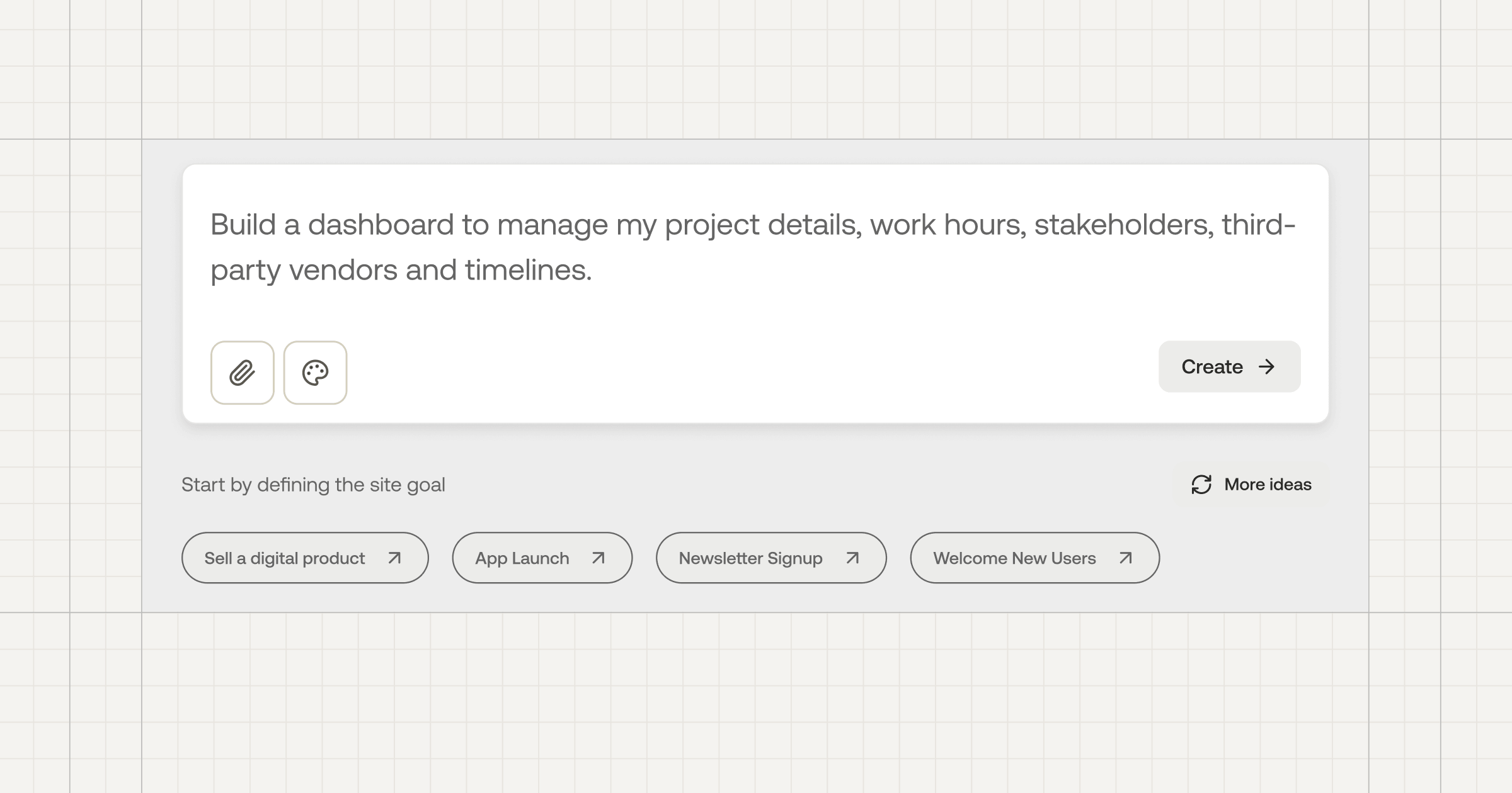
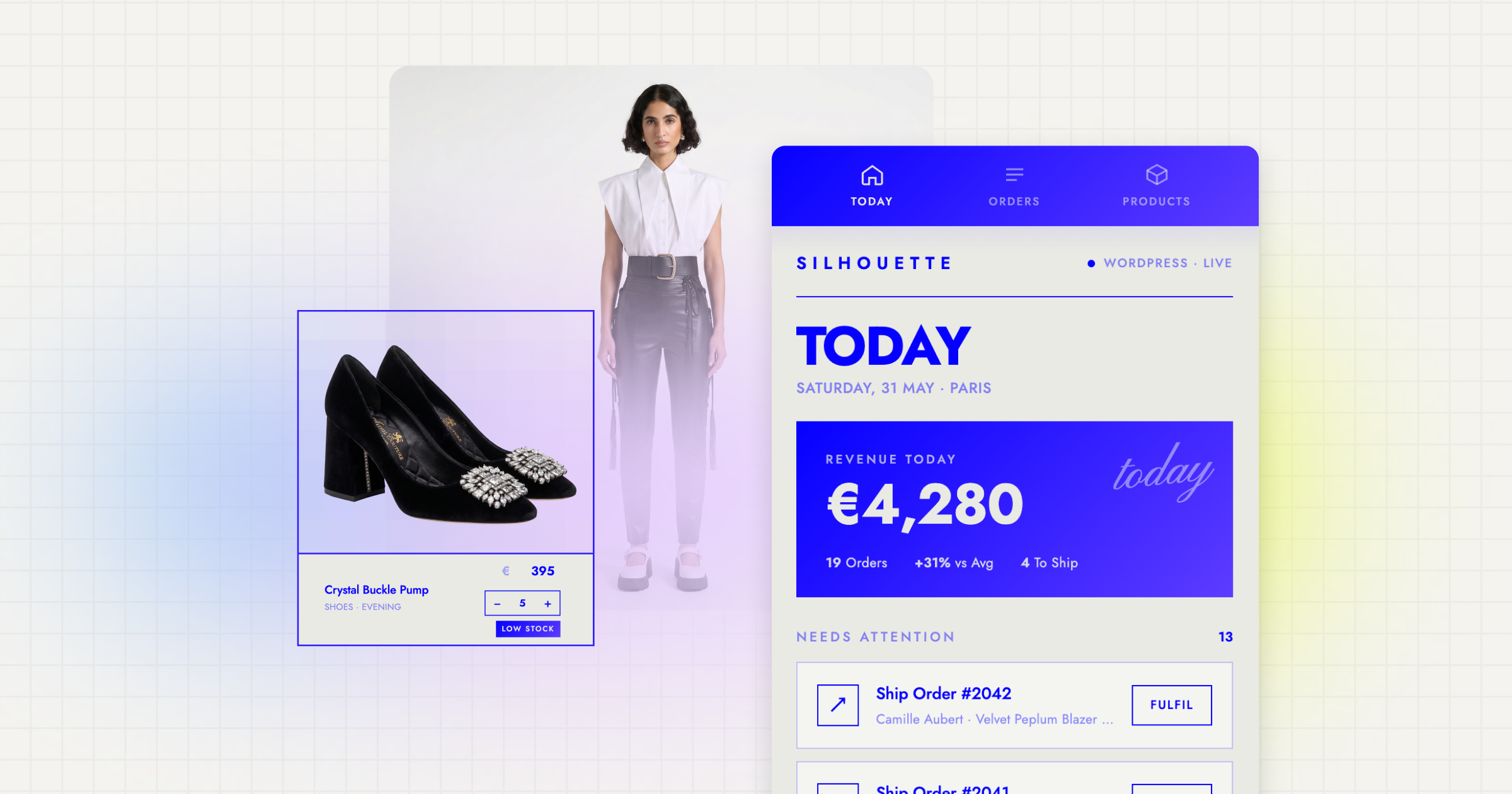
- Prompt the parent or educator dashboard as its own build, with its own login, showing progress, settings, and controls without exposing raw content the child created unless there is a real reason to.
- Publish both, with Sticklight’s built-in security scan run on each build and a custom domain connected once the product is ready.
Course creators building a kids’ learning product often want a third piece too, a simple parent-facing summary of what their child completed. That fits naturally into the dashboard build rather than the child’s app, keeping the two experiences separate on purpose.
Where the Accessibility Skill does the heavy lifting
Skills in Sticklight are packaged expertise you add to a prompt with one click. For kids’ products, the Accessibility Skill is the one we lean on hardest, because it ships WCAG-aligned markup, visible focus states, and ARIA labeling as part of the build itself, not as a follow-up pass.
That matters in a few concrete ways for young users: a child using a switch device or a screen reader gets a coherent experience instead of a broken one, headings and labels stay clear enough for a child with a shorter attention span to follow, and keyboard and touch navigation both work without relying on precise motor control. Skills also compound. An accessibility pattern refined on one kids’ product carries forward and gets sharper on the next one.
Reading the error twice before searching for it online has saved me more hours than any shortcut.
Itamar Haim
Built by the Elementor team. Powered by Claude.
Let it glow.