
How to Add a Photo Gallery to Your Website in 2026

Adding a photo gallery to your website means choosing a layout that fits how many images you have, picking a tool that matches how your site is built, and setting up your images so the page still loads fast. In 2026 the quickest path is usually a page builder’s native gallery block, a dedicated gallery plugin, or a prompt-based tool that builds the gallery for you, paired with images that are resized and compressed before upload.
The layout and the loading speed matter more than which specific tool you pick, so get those two decisions right first.
Picking a layout for your photos.
The right layout depends on what the photos are for and how many you have. A grid works well for product shots or portfolio pieces where every image carries roughly equal weight, since visitors can scan the whole set at a glance. A masonry layout, where rows adjust to each photo’s natural height, suits mixed orientations better than a rigid grid and avoids awkward cropping. A carousel or slider makes sense when you want to feature a small, curated set on a homepage without taking up much vertical space, though it hides most of the images behind clicks or swipes. For a larger set, a grid with a lightbox, where clicking a thumbnail opens a full-size view, keeps the page light while still giving visitors the detail they came for.
- Grid, for evenly weighted photos like products or team headshots.
- Masonry, for mixed orientations and varied aspect ratios.
- Carousel, for a small featured set in a tight space.
- Grid with lightbox, for larger collections that need detail on demand.
Choosing how to build it.
Most page builders now include a native gallery block, which is usually the fastest route since it already matches your site’s fonts, spacing, and colors without extra setup. If your platform does not have a built-in option, a dedicated gallery plugin adds features like filtering by category, lightbox viewing, and lazy loading. A hosted gallery embed is a reasonable choice for a static site or a page built outside a content management system, since the service handles storage and display and you just drop in a snippet. And if you are starting from a blank page, some newer tools let you describe the gallery you want, how many columns, what happens on click, what style, and generate working code from that description, which saves the step of hand-building the layout yourself.
Getting your images ready.
A gallery is often the heaviest part of a page, so prepare your images before you upload them rather than after visitors start complaining about load time. Resize photos to the largest size they will actually display at, since a four thousand pixel wide image shown in a three hundred pixel thumbnail is wasted bandwidth. Compress each file to reduce its size without a visible drop in quality, and use a modern format where your platform supports it, since it typically produces smaller files than older formats at the same quality. Write a short, accurate description for each image too, since that text helps screen reader users and search engines understand what the photo shows.
Keeping the page fast.
Lazy loading, where images below the fold only load once a visitor scrolls near them, is the single biggest speed improvement available for a photo-heavy page, and most builders and plugins now turn it on by default. Check that yours does. Beyond that, serve images at a few different sizes so a phone downloads a smaller file than a desktop monitor does, a technique usually called responsive images. If your gallery uses a lightbox, make sure the full-size image only loads when someone actually clicks to open it, not the moment the page renders.
Making it easy to navigate.
A gallery should work for a visitor using a keyboard or a screen reader, not only a mouse. Confirm that thumbnails can be reached and opened with the tab and enter keys, that a lightbox can be closed without a mouse, and that focus returns to the right place afterward. If the gallery is organized by category or tag, keep the filter controls simple and clearly labeled, since a confusing filter setup will frustrate visitors faster than a plain, well-ordered grid ever would.
The cost of a growing system I run rarely spikes, it drifts, and drift is much easier to ignore than a spike ever is.
Itamar Haim
Where Sticklight fits
Sticklight is a vibe-coding platform for professional web creators: describe the gallery you want in plain language, columns, lightbox behavior, filtering, and it turns that prompt into a production-ready result with the image handling already wired in. The same approach extends past a single gallery, since Sticklight is built to take a creator from a prompt to production-ready websites, apps, dashboards, CMS platforms, and tools, going beyond a single page toward being a full-stack creator.
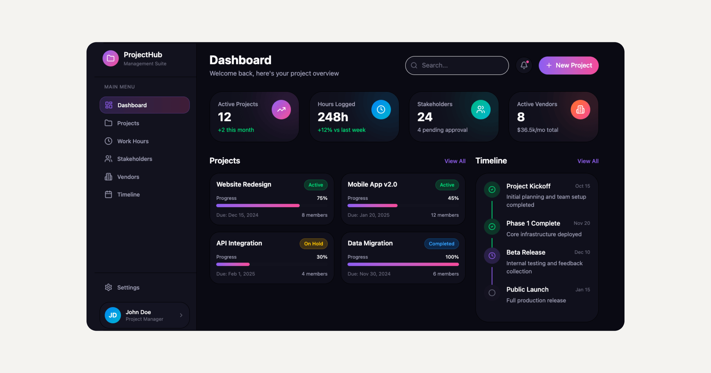
If you already build with WordPress or Elementor, Sticklight sits alongside that work rather than replacing it, extending what you can ship without giving up the tools you already know.
Frequently asked questions
What is the easiest way to add a photo gallery to my website?
If your page builder has a native gallery block, start there since it already matches your site’s design. Otherwise a dedicated gallery plugin or a hosted embed will get you a working gallery without much setup.
Should I use a grid, a masonry layout, or a carousel?
Use a grid for evenly weighted photos like products, masonry for mixed orientations, and a carousel for a small featured set on a homepage. A grid with a lightbox works well for larger collections.
How do I keep a photo gallery from slowing down my site?
Resize and compress every image before uploading, turn on lazy loading so photos below the fold load only when scrolled to, and serve smaller image sizes to phones than to desktop screens.
Do I need to add alt text to every gallery image?
Yes. A short, accurate description for each photo helps screen reader users understand the image and helps search engines index the page correctly.
Can a photo gallery be navigated without a mouse?
It should be. Check that thumbnails can be reached and opened with the tab and enter keys, that a lightbox can be closed without a mouse, and that keyboard focus lands somewhere sensible afterward.
Built by the Elementor team. Powered by Claude.
Let it glow.