
How to Build a Dashboard in 2026

To build a dashboard, define the questions it needs to answer, connect the data sources that hold the answers, choose a small set of metrics that matter, and design clear charts around them. Add filters so people can slice the view themselves, then publish it and refine it as real usage shows what is missing.
That is the short version, but the details decide whether your dashboard gets opened every morning or ignored after week one. This article walks through what a dashboard actually does, how to pick the right questions and metrics, how to connect your data without a fragile setup, and how to add just enough interactivity to make it useful. We will also cover how to keep improving a dashboard once real people start relying on it.
What a dashboard is and what it is for
A dashboard is a single view that turns raw numbers into a decision-ready picture. It pulls data from one or more sources and displays it as charts, tables, and summary figures so you can spot trends and outliers at a glance, without opening spreadsheets or running reports by hand.
Good dashboards exist to answer specific, recurring questions, not to show everything you could possibly measure. When you build a dashboard with a clear purpose, people trust it and check it often. When it tries to cover every metric at once, it becomes noise that nobody opens twice.
Decide the questions your dashboard should answer
Before you touch any data, write down the two or three questions the dashboard exists to answer, such as “are we hitting our weekly signup target” or “which product line is losing margin”. Every chart you add later should trace back to one of these questions.
This step is where most dashboard projects go wrong. Teams start connecting data first and figuring out the point later, which produces a screen full of charts nobody can use. Naming the questions up front keeps the whole build focused and makes it far easier to know when the dashboard is actually finished.
Connect your data sources
Once you know what you are trying to answer, gather the data that answers it. Most dashboards pull from a mix of places, and the goal is to bring them together without hand-copying numbers every week. Common sources include:
- Databases such as Postgres, MySQL, or a hosted SQL instance
- Spreadsheets, whether Google Sheets or exported CSV files
- Analytics platforms like web or product analytics tools
- Third-party APIs from payment processors, CRMs, or ad platforms
Wherever possible, connect live sources instead of importing static snapshots. A dashboard that refreshes automatically stays trustworthy; one that requires manual updates tends to quietly go stale within a month, and stale numbers are worse than no dashboard at all.
Choose metrics that matter and design clear charts
Pick metrics that move in response to real decisions, not vanity numbers that always look good. Revenue, active users, conversion rate, and churn tend to matter more than raw page views or total signups, because they reflect outcomes rather than activity.
For each metric, choose the chart type that matches the question. Use line charts for trends over time, bar charts for comparing categories, and single big numbers for targets everyone should see instantly. Keep color use consistent and avoid cramming more than a handful of charts onto one screen, since a crowded layout defeats the purpose of a dashboard.
Add filters and interactivity
A static dashboard answers one question well. An interactive one lets different people ask their own version of that question. Adding filters for date range, region, team, or product line means one dashboard can serve marketing, sales, and leadership without three separate builds.
Keep interactivity simple. A date picker, a couple of dropdown filters, and the ability to drill from a summary chart into the underlying rows will cover most real needs. Overloading the dashboard with configuration options usually just makes it slower and harder to trust.
Build, share, and refine based on real use
Ship a working version as soon as it answers your core questions, then watch how people actually use it. Which charts do they check first, which filters do they touch, and which sections do they scroll past without a second look.
Use that behavior to guide the next round of changes. Remove charts nobody opens, promote the ones people check daily to the top, and tighten the metrics as your goals shift. A dashboard is never really finished, it is a living view that should keep matching what your team actually needs to know.
Where Sticklight fits
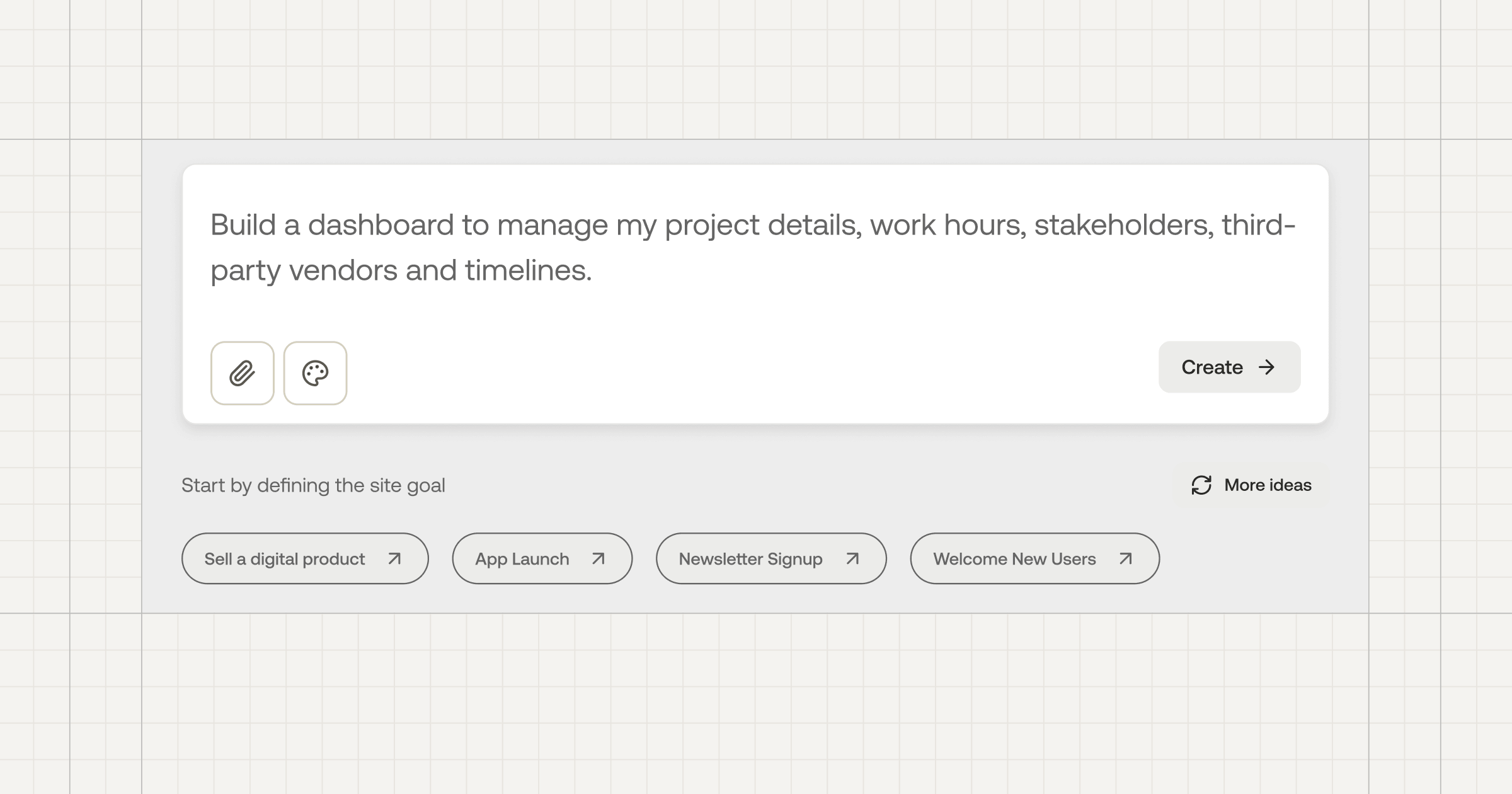
Sticklight turns a plain-language prompt into a working, production-ready dashboard, complete with live data connections, real charts, and the filters your team needs to explore the numbers themselves. Describe the metrics you care about and the sources they come from, and you get an app you can actually use, not a mockup. It is one more way Sticklight helps you become a full-stack creator, building the internal tools you need without waiting on a dev cycle.
You do not have to choose between your dashboard and everything else you have already built. Sticklight is designed to sit alongside an existing WordPress or Elementor site rather than replace it, so your marketing pages, your data tools, and everything in between can keep growing together.
Frequently asked questions
How do I build a dashboard?
Decide the questions it should answer, connect your data sources, choose the key metrics, design clear charts and tables, add filters so users can explore, then refine based on how people use it.
What makes a good dashboard?
A clear purpose, the few metrics that matter, a logical layout, readable charts, useful filters, and fast load times. Avoid clutter and vanity metrics.
What data can a dashboard connect to?
Common sources include databases, spreadsheets, analytics tools, and APIs. The right tool lets you combine several into one view.
Do I need to code to build a dashboard?
Not always. Many tools let you build dashboards visually, while custom metrics or data pipelines can benefit from some development.
What is the difference between a dashboard and a report?
A dashboard is a live, interactive view of current metrics, while a report is usually a static snapshot summarizing a period.
Built by the Elementor team. Powered by Claude.
Let it glow.