How to Create a Landing Page in 2026

Creating a landing page comes down to five moves: pick one clear goal for the page, write a headline and short copy that speak straight to that goal, lay out the page so a visitor’s eye moves toward the point, add a single call to action, and then publish and test before calling it done. Skip any one of these steps and the page tends to blur into a generic homepage instead of a focused page built to convert.
The fastest path is to work in that order rather than jumping straight to visuals. A goal you can state in one sentence shapes the headline, the headline shapes what copy earns a place on the page, and the layout exists only to carry a visitor toward the one action you picked. Most modern builders, from drag-and-drop tools to AI-assisted platforms, follow this same sequence under the hood, whether or not the interface shows it.
Set one clear goal
Before opening any builder, write down the single action you want a visitor to take: book a call, start a trial, download a guide, or buy a product. A page trying to do three things usually does none of them well, because the headline, layout, and button all end up competing for attention instead of pointing the same direction.
Write that goal as one sentence and keep it visible while you build. If a section, image, or extra link does not support that sentence, it belongs somewhere else on your site, not on this page. This discipline is what separates a landing page from a general marketing page.
Write a headline and copy that carry that goal
The headline should state the outcome a visitor gets, not just the name of your product or service, and the paragraph underneath should back it up with a concrete detail or two rather than vague praise. Keep sentences short and specific. Cut any line that does not move a visitor closer to the action you defined in the first step.
Read the page out loud once it is drafted. If a sentence sounds like something no one would actually say, rewrite it in plainer language. Visitors skim first and read closely only once something has caught their interest, so the first few words of each section carry more weight than the rest.
Design a layout that guides the eye
A landing page reads top to bottom, so order sections the way you would explain the offer out loud: what it is, why it matters, proof it works, and then the action. A short list keeps most pages easy to build and easy to scan.
- A hero section with the headline and a supporting line
- A benefit or feature section with two to four points
- A proof section, such as a testimonial or a simple use case
- A single action area near the bottom, often repeated near the top
Keep spacing generous and avoid crowding the page with extra menus or links that pull attention away from the one path you want visitors to take.
Add one call to action
Choose one button label and one action, then repeat that exact phrase throughout the page instead of mixing invitations like “sign up” in one spot and “get started” in another. A single, consistent action reduces hesitation and makes it obvious what happens next, whether that is a form, a checkout, or a calendar link.
Place the action near the top for visitors who already know what they want, and again at the bottom for visitors who needed the full page to decide. Avoid placing a second, different action next to it, since a choice between two buttons slows people down more than having only one.
Publish and test
Once the page is live, check it on a phone screen first, since much of landing page traffic arrives on mobile, then confirm the form or checkout actually completes end to end. Watch how visitors behave for the first week or two, and adjust the headline or the call to action if people land on the page but do not take the next step.
Small changes tend to matter more than a full redesign at this stage. Swapping a headline, shortening a form, or moving the action button higher on the page often has more effect on results than adding new sections, so test one change at a time and give it enough time to show a pattern.
Where Sticklight fits
Sticklight is a vibe-coding platform that turns a prompt into a production-ready landing page, so once you have the goal, headline, and layout worked out, you can describe the page in plain language and get a working version to launch and test, rather than assembling every section by hand.
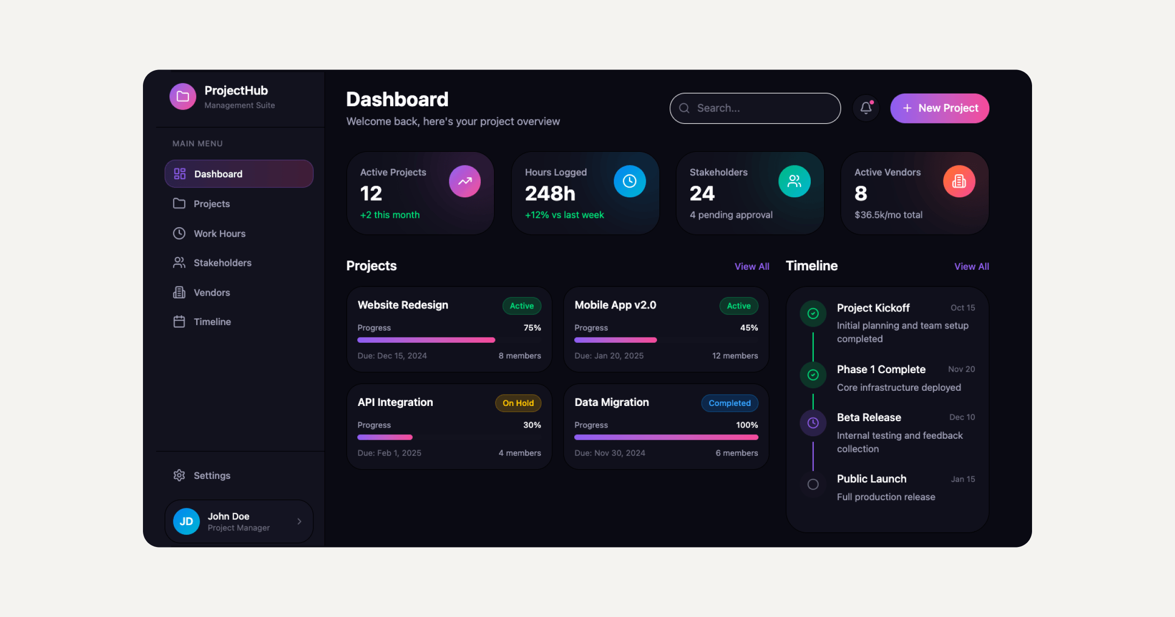
That approach sits alongside tools like Elementor and platforms like WordPress rather than replacing them: a team can use Sticklight to get a first version live and tested quickly, then carry it further in Elementor or fold it into a broader WordPress site as the project grows.
Frequently asked questions
How do I create a landing page?
Set one clear goal, write a headline and copy around it, design a simple layout with a strong call to action, add a form or button, then publish and test. Modern tools can build the structure from a short description.
What is a landing page?
A landing page is a focused web page built around a single goal, such as signing up, buying, or booking. It removes distractions and guides visitors toward one action rather than general browsing.
What makes a good landing page?
A good landing page has one clear goal, a strong headline, focused copy, a single call to action, and a clean layout. It loads fast, works on any device, and removes anything that distracts from the goal.
What is the difference between a landing page and a homepage?
A homepage introduces your whole site and links to many places, while a landing page focuses on one goal and one action. Landing pages are often used for campaigns, ads, or specific offers.
Do I need to code to create a landing page?
No. Many builders and modern tools let you create a landing page without code, while custom features can benefit from developer help. You can start simple and refine as you learn what converts.
Built by the Elementor team. Powered by Claude.
Let it glow.