How to make a mobile app in a few easy steps (2026)

To make a mobile app, you define the one thing people need to do on their phone, describe that in a plain-language prompt, generate a working first version, refine the layout for touch screens, and publish it. On Sticklight, the vibe-coding platform built by the Elementor team and powered by Claude, that whole path runs through one prompt-build-publish flow, and you keep full control of every pixel once the first version exists.
Before the five steps, it helps to know that “mobile app” is not one thing. It can mean a native iOS or Android app you download from a store, a responsive web app that works beautifully on a phone browser, or a web app you add to your home screen. We will be upfront about which of those Sticklight builds, and where a native store app takes a different path.
- “Mobile app” can mean a native store app, a responsive web app, or an installable web app, and each one has a different build path.
- Sticklight builds production-ready, responsive web apps from a prompt that look and feel great on phones, tablets, and desktops.
- The five-step flow is: define the core mobile flow, write the prompt, generate the first version, refine the responsive layout, and publish.
- Skills add packaged expertise, like accessibility or performance, to your app with one click during the build phase.
- You keep full control after AI generates the first version, so you can edit every pixel and adjust the layout by hand.
- If you specifically need a listing in the App Store or Google Play, that is native app development, a separate path from a Sticklight web app.
Before you make a mobile app, know what “mobile app” means
People use “mobile app” to describe three fairly different products, and mixing them up early is the most common way a project stalls. A native app is written for iOS or Android specifically, then submitted to the App Store or Google Play. It can reach deeper into the phone’s hardware, but it also means app store review, separate codebases, and ongoing platform updates.
A responsive web app is a single build that adapts its layout to whatever screen it is shown on. Open it on a phone and it behaves like an app: full-width buttons, thumb-friendly navigation, no pinching or zooming. Open it on a laptop and the same product reflows into a desktop layout. There is no store, no separate download, and one URL to maintain.
An installable web app sits between the two. It is still a web app behind the scenes, but a phone can add it to the home screen so it opens like any other icon.
Sticklight builds the second kind: production-ready, responsive web apps generated from a prompt, refined with the same craft as a senior designer and developer, and published on your own domain. If your goal is a booking tool, a client dashboard, an internal form, or a member portal that people mostly reach on their phones, that is exactly the surface Sticklight ships. If your goal is specifically a listing in the App Store or Google Play, that calls for native development, which is a different build path than the one described here.
Step 1: Define your app and its mobile-first core flow
Before you write a single prompt, decide on the one thing your app has to do well on a phone. Not five things, one. A booking app books a slot. A tracker logs an entry. A catalog shows products and lets someone save a favorite. That single job is your core flow, and everything else in the app supports it.
Write down the core flow as a short sequence of screens or states: what someone sees first, what they tap next, and what confirms the action worked. Keep the sequence short enough to do one-handed, with thumbs, on a phone held in one hand. If a step needs a lot of typing or a wide table, plan how you would simplify it for a small screen before you move on.
- Name the single primary action the app exists to support.
- List the 3 to 5 screens or states that action passes through.
- Note any data you need to collect, store, or display along the way.
Step 2: Describe it in a prompt
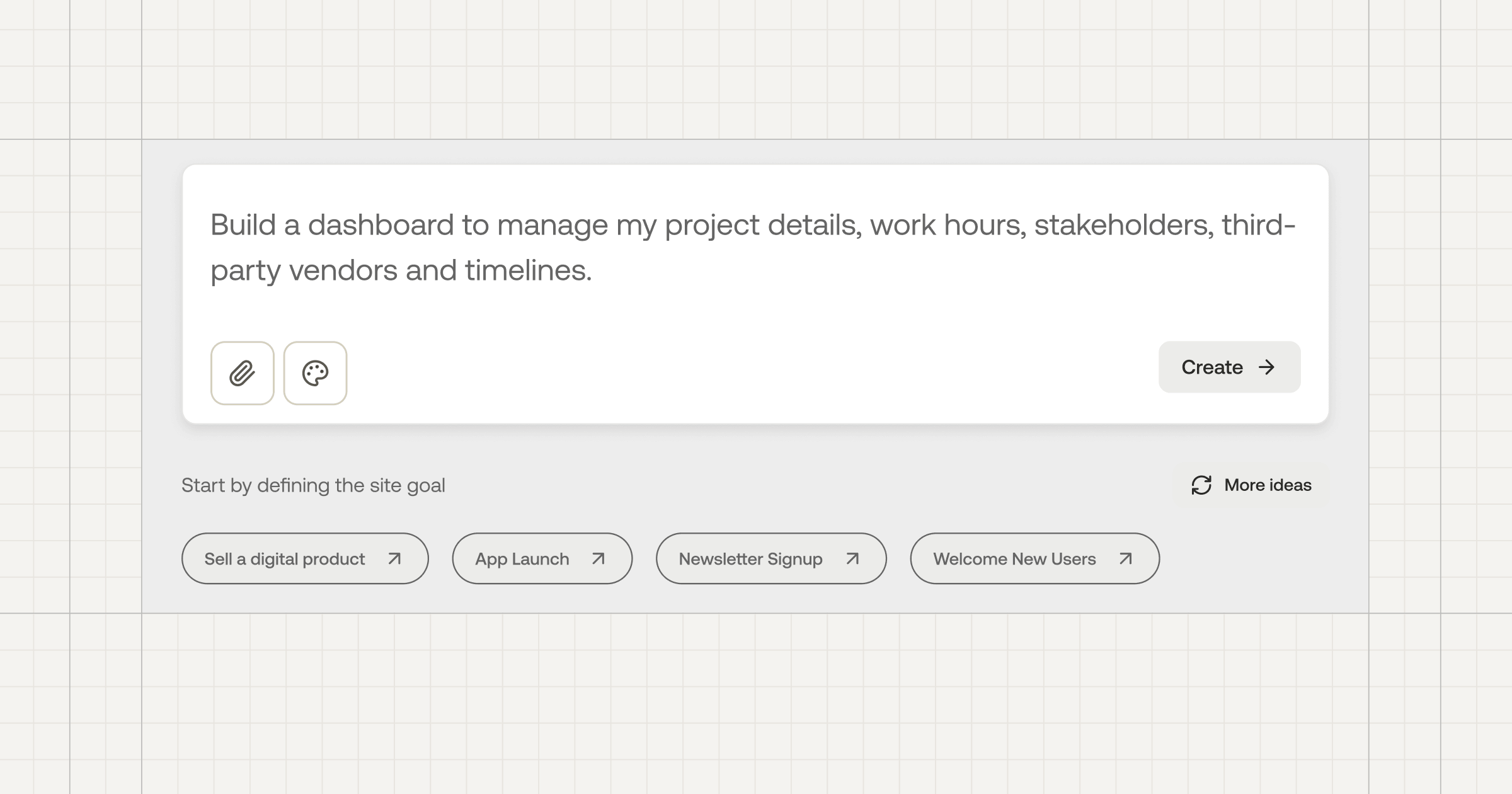
With the core flow in hand, describe your app in plain language, the same way you would explain it to a colleague. Say what the app does, who uses it, and call out that it needs to work well on a phone first. Include the screens from step one and any forms, lists, or data the app needs to handle.
For a straightforward app, the main prompt box is enough. For something with more moving parts, like a booking system with availability rules or a dashboard pulling from multiple data sources, Plan Mode breaks the request into stages before anything gets built, so you can check the plan matches what you actually want. If your app needs to work with tools you already use, Connectors let you bring those into the build based on your use case.
A clear prompt names the user, the core action, and the screens involved. Vague prompts produce vague apps.
Step 3: Generate the first version
Once your prompt is ready, Sticklight turns it into a working build, not a mockup. That is the standard the platform holds itself to: production-ready output with the craft of a senior designer and developer, not a demo you would rebuild before anyone could use it. AI does the heavy lifting here, laying out the screens and wiring the core flow into a version you can click through right away.
Expect the first version to be a strong starting point rather than a finished product. Click through the core flow you defined in step one and check whether it holds up: does the primary action still take the fewest taps possible, and does the layout make sense on a phone-sized screen? Whatever needs adjusting becomes your list for step four.
Step 4: Refine the responsive layout and add Skills
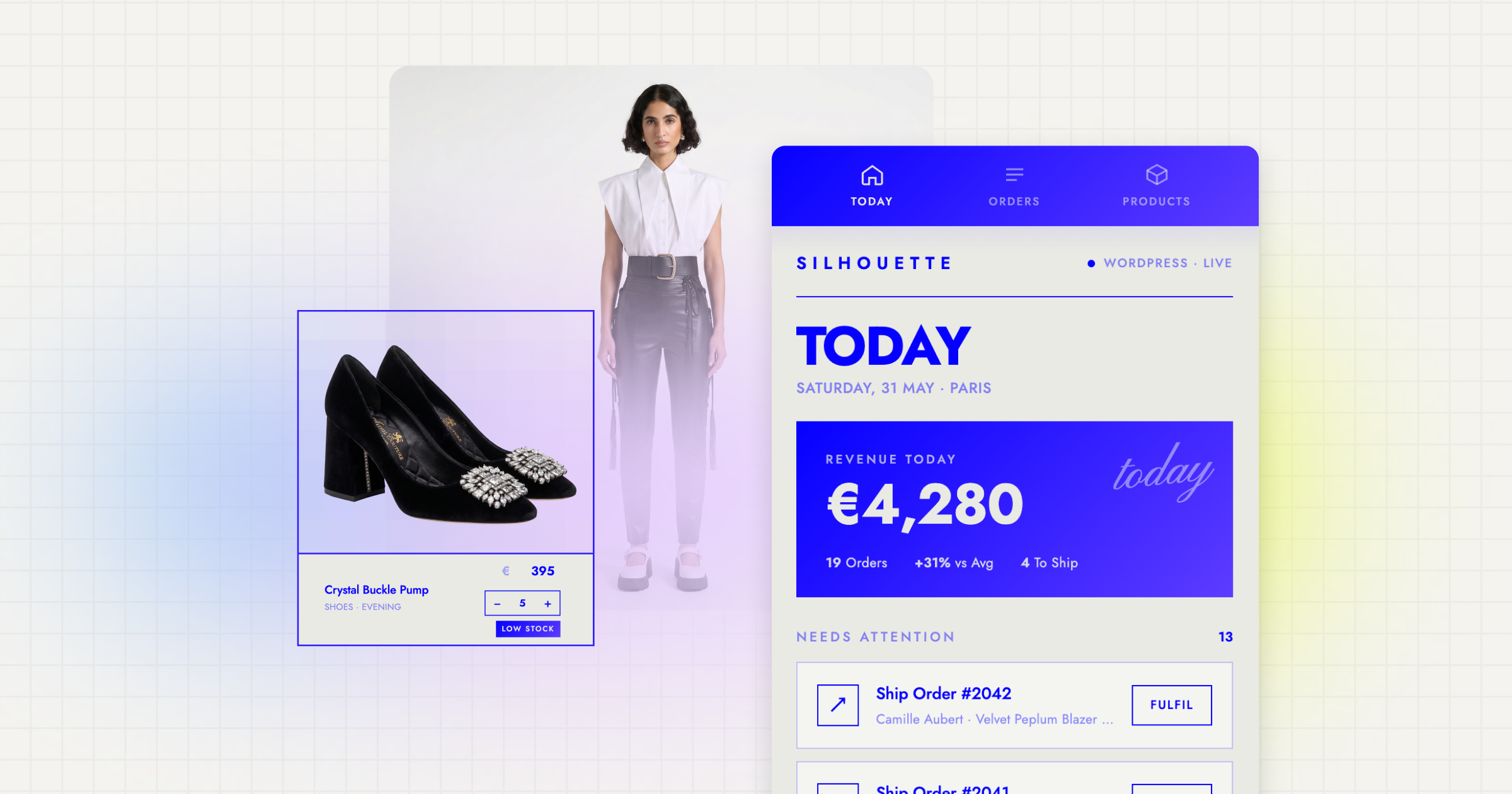
Now you take back the pixel-level control that a prompt alone cannot give you. On the canvas, you can adjust spacing, resize touch targets, reorder navigation, and edit the layout directly, including editing the underlying code when you want precision a visual edit cannot reach. Check the app at phone width specifically: buttons should be easy to tap, text should be readable without zooming, and forms should not force awkward scrolling.
This step is also where Skills earn their keep. A Skill is packaged expertise you add to the build with one click, and two are especially useful for a mobile-facing app:
- Performance Skill: applies production-ready performance practices to your build, which matters most on the mobile connections and devices your app will actually run on.
- Accessibility Skill: ships WCAG-compliant markup, focus states, and ARIA, so the app works for people using screen readers or keyboard and switch navigation, not only a mouse and a large screen.
Skills compound across projects. Once you have used Performance and Accessibility here, they are one click away on your next build too.
Step 5: Publish and iterate
When the layout and flow feel right, publish. Sticklight runs a security scan on every build, includes SEO basics out of the box, and lets you connect a custom domain so the app lives at your own address with hosting handled for you.
Publishing is not the end of the process. Watch how people use the core flow, and come back to refine it: tighten a form, reorder a screen, add a Skill you skipped the first time. If you later decide you also want a listing in the App Store or Google Play, treat that as a separate native project rather than an extension of this one, since the two serve different distribution needs.
The people who build things well aren’t the ones who read the most guides. They’re the ones who finished the most small projects.
Itamar Haim
Built by the Elementor team. Powered by Claude.
Let it glow.