
Travel app development: how to build a travel app step by step

Travel app development is the process of turning what a traveler actually does, search, compare, book, plan, and revisit a trip, into a working product, built alongside the operator tools that keep bookings current behind it. The fastest path we have found is to build both sides at once: a traveler-facing app for search, itineraries, and saved trips, plus a dashboard for the team managing listings and bookings.
This guide walks through what a travel app typically needs, then a practical build path using Sticklight, the vibe-coding platform built by the Elementor team and powered by Claude to help web creators go beyond websites and build full-stack products like this one. We will be direct about where live maps, real inventory, and payments depend on a third-party connection rather than something a prompt can invent.
- A working travel app needs search and booking, itineraries, maps and location, reviews and recommendations, saved trips, and payments, plus an operator side to manage it all.
- Start travel app development by mapping the traveler journey in plain language before writing a prompt.
- Prompt the core booking and itinerary experience and the operator dashboard as one connected build, not two projects.
- Refine details by hand on the canvas. Sticklight hands back full control after the first build.
- Add Skills like Accessibility, SEO, Performance, and Localization to raise the build to a production standard.
- Live maps, booking inventory, and payments come through integrations and connectors, not fabricated data.
What a travel app needs to earn a traveler’s trust
Before any build decisions, it helps to be clear about what travelers expect a trip-planning app to do. Most travel products, whether flights, hotels, tours, or activities, share a common core.
- Search and booking. A traveler filters by dates, location, and preferences, then reserves or purchases in as few steps as possible.
- Itineraries. A place to see a trip laid out day by day, with the flexibility to add or move items.
- Maps and location. Visual context for where things are relative to each other and to the traveler.
- Reviews and recommendations. Social proof and guidance that help a traveler choose between similar options.
- Saved trips. A way to bookmark, revisit, and share plans that are not finished yet.
- Payments. A checkout flow that a traveler trusts enough to hand over a card number.
Not every travel app needs all six on day one. A tour operator building a booking widget cares most about search, booking, and payments. A destination guide cares most about itineraries, maps, and reviews. Knowing which your first version needs keeps the build focused.
Travel app development starts with the traveler journey
The stage most teams skip is also the one that saves the most rework later: writing down the traveler journey before opening a prompt box. It does not need to be a formal document, just a short, plain-language description of what a specific traveler does, in order, from opening the app to arriving somewhere.
A useful journey map for travel app development answers a few questions. What is the traveler searching for first, a destination, a date range, or a type of experience. What decides whether they book now or save it for later. Where does the operator need to step in, to confirm a booking or adjust availability.
This journey becomes the backbone of your first prompt. The clearer it is, the less back-and-forth you need, because the prompt describes an actual sequence of screens instead of a vague idea of “a travel app.”
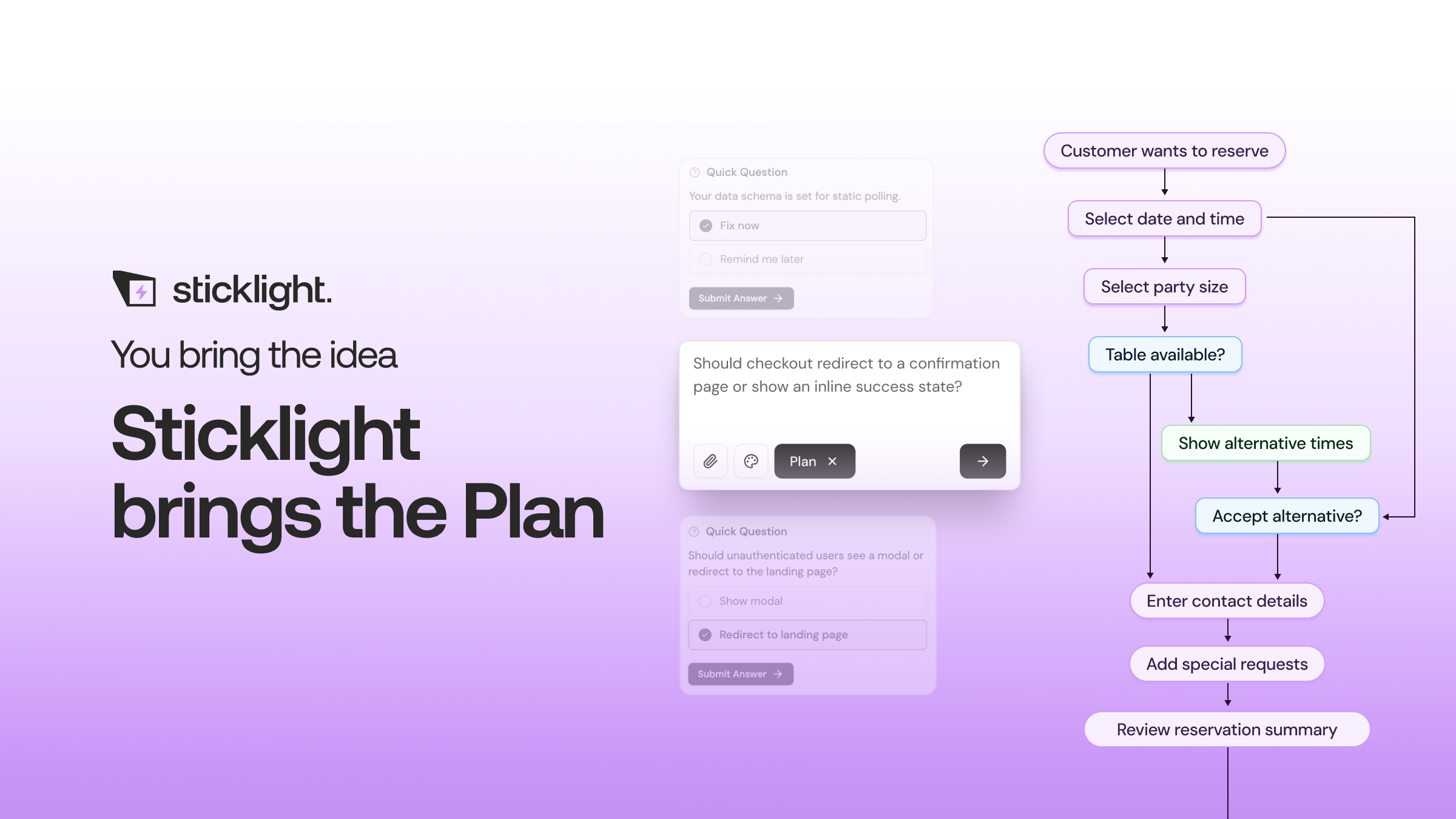
Prompt the core booking and itinerary experience
With the journey mapped, the next stage is prompting the traveler-facing core: search and browse, a booking or reservation flow, and an itinerary view that holds what a traveler has booked or saved. The Prompt phase does the initial heavy lifting here, generating a production-ready starting point rather than a rough demo.
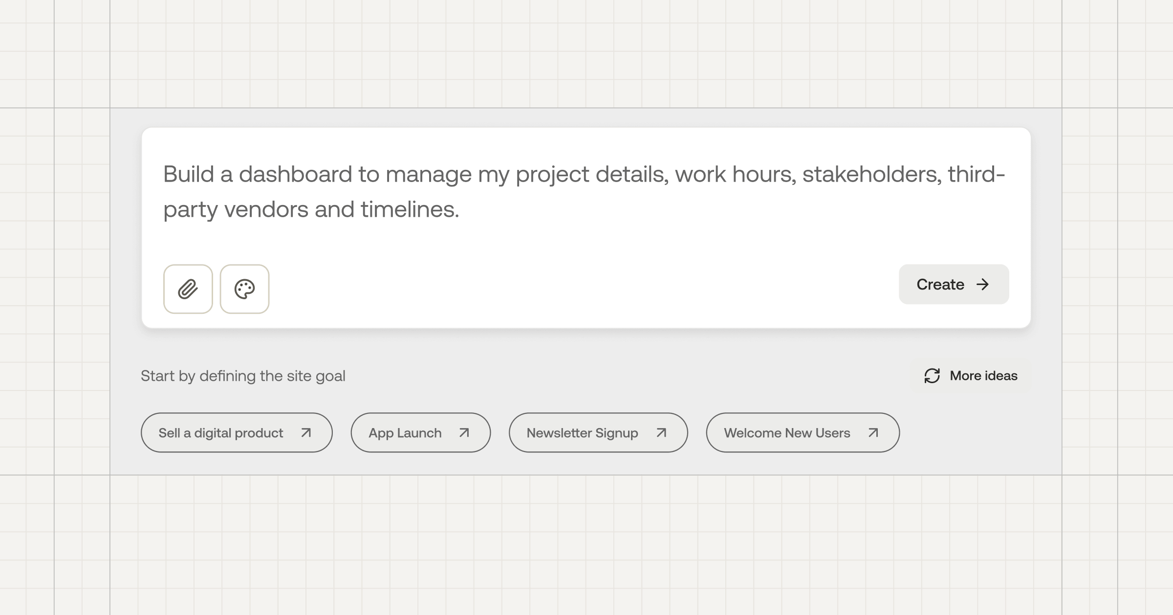
A prompt for this stage works best when it names the actual pages and the data on each one, not just the general concept. For example:
Build a travel booking app with a search page (destination, date range, travelers), a listing page for tours and stays with photos, price, and a review score, a booking flow with a summary and checkout step, and an itinerary page that groups confirmed and saved bookings by trip.
That turns into working screens you can click through, not a static mockup. From there, the traveler-facing side of the build shifts from generating to shaping.
Build the operator dashboard alongside it
A travel app without an operator side is only half a product. Someone on your team needs to see incoming bookings, update availability, adjust listings, and answer questions, and that dashboard is easiest to build while the traveler app is still fresh in the same project.
A useful operator dashboard typically includes a bookings list with status (pending, confirmed, canceled), a listings manager, basic availability controls, and a view of traveler messages. Because Sticklight builds websites, apps, dashboards, CMS, and internal tools from the same prompt-first flow, the dashboard can be prompted as an extension of the traveler app, not a second platform.
Keeping both sides in one project also keeps them in sync. When availability changes on the operator side, search results on the traveler side reflect that without a separate integration step.
Refine on the canvas
Once the core booking flow and the dashboard exist, the real craft work begins. Sticklight generates a strong starting point, then hands full control back to the creator to adjust every pixel by hand or edit the code directly on the canvas.
For a travel app, this stage is where the details that build trust get tuned: how listing cards are laid out, how price and availability are presented, how the itinerary groups items by day or by trip, and how the booking confirmation reads. Manual editing and direct code editing on the canvas mean this refinement does not need a new prompt or losing what already works.
This is also the stage to test the traveler journey against what actually got built, and adjust anything that does not match how a real traveler would move.
Add Skills for the details that make travel apps feel finished
Skills are packaged units of expert know-how added to a build with one click, and they are where a travel app moves from functional to production-grade. A few are especially relevant here.
- Accessibility ships WCAG-compliant markup, focus states, and ARIA, which matters for a booking flow that needs to work for every traveler.
- SEO ships meta, schema, sitemap, and on-page best practices, useful for destination and listing pages that need to be found.
- Performance matters for travelers browsing on mobile connections while actually traveling.
- Localization is worth adding early if your travelers or destinations span more than one language.
- Micro-interactions and Onboarding help a booking flow feel considered and help first-time users understand the app quickly.
Skills compound across a project, so one added to the booking flow carries the same standard into the dashboard and any pages you add later.
Connect real data, then publish
Here is the honest part: live maps, real-time flight or hotel inventory, and payment processing are not things any AI builder invents from a prompt. They come from real providers, brought in through an integration, not a guess.
Sticklight’s Connectors and the Sticklight MCP, which link Sticklight to tools you already use, are the entry points: a mapping provider for live location data, a booking or inventory system, and a payment processor for checkout. Your first build can include placeholder listings and a working booking flow end to end, then swap in live data as a deliberate, separate step.
Once real data is connected, Publish includes SEO built in, a security scan on every build, custom domain connection, and app hosting, so the travel app goes from working preview to a product travelers can use.
Something shifts the moment I stop copying code and start guessing at reasons, and that is where real understanding begins.
Itamar Haim
Built by the Elementor team. Powered by Claude.
Let it glow.