
UX and app development: everything you need to know

UX and app development are two halves of the same job. App development turns an idea into working software, and UX decides whether people can actually get something done with it. When the two move together from the first prompt to the final release, an app feels obvious to use. When UX gets bolted on after the build is “done,” usability problems surface late and cost more to fix.
This guide covers what UX really means, why it decides whether an app succeeds, and what practical UX principles look like inside a real build process. We also show how Sticklight, built by the Elementor team and powered by Claude, supports good UX in practice.
- UX covers research, information architecture, flows, usability, accessibility, and visual design, not just how an app looks.
- Good UX is a business decision: it shapes retention, support load, and whether people finish the tasks they came to do.
- Usable apps start with clear user goals and a mapped structure before anyone designs a screen.
- Accessibility and micro-interactions belong inside the app development process, not tacked on afterward.
- Sticklight turns a plain-language prompt into a real interface you refine by hand on a visual canvas.
- Skills like design system, accessibility, onboarding, and micro-interactions package proven UX practices into every build.
What UX actually means in app development
UX, or user experience, is the set of decisions that determine how someone finds, understands, and completes a task inside an app. It is broader than the interface a person sees, touching every layer of the build.
- Research. Understanding who uses the app and what they are trying to accomplish.
- Information architecture. Organizing content and navigation to match how people think about the task.
- Flows. Mapping the exact steps a person takes to complete an action.
- Usability. Making sure the app is learnable, efficient, and forgiving of mistakes.
- Accessibility. Building so people using a keyboard or a screen reader can complete the same tasks.
- Visual design. Using hierarchy and consistency to make the interface easy to scan and trust.
None of these pieces work in isolation. Research without flows produces insight nobody acts on, and visual design without information architecture produces a pretty screen that hides the feature someone needs.
Why UX and app development cannot be separated
An app can be technically correct and still fail if people cannot figure out how to use it. UX is often the difference between a feature that gets adopted and one that quietly goes unused. When a first-time user understands what to do within seconds, they stay. When they hesitate or hit an error with no clear next step, they leave and rarely come back.
The cost of weak UX shows up in places founders and product managers already track: support tickets, churn, and low feature adoption. A confusing onboarding flow turns into a support queue, and an inaccessible form turns into users who cannot complete a purchase. UX also shapes trust: an app that behaves predictably and recovers gracefully from errors reads as reliable.
Start with research before you design a single screen
The strongest app development processes resist the urge to jump straight to screens. Before any interface exists, it helps to answer a few direct questions: who is the primary user, what task are they trying to complete, and what has not worked before.
Research does not need to be a long formal study. Talking to five real or prospective users about how they currently solve the problem your app addresses surfaces more than a week of internal debate. Teams that skip this step tend to design for themselves, and what feels obvious to a founder is often opaque to someone opening the app for the first time.
Information architecture: the map beneath the interface
Information architecture is the structure that decides where everything lives: which features sit behind which tab, how deep a setting is buried, what gets top-level navigation. Get this wrong, and even a well-designed screen feels disorganized, because people cannot predict where things are.
A useful test is to write your app’s main tasks as short sentences, then check whether the navigation matches that language. If a user’s task is “find my past orders” and that feature sits three menus deep under a generic label, the architecture is fighting the user.
Good information architecture is invisible. People only notice it when it is missing, because that is when they get lost.
Designing flows and interactions people can trust
A flow is the sequence of steps someone takes to complete a task, such as creating an account or booking a slot. Strong flows share a few practical traits.
- Ask for the minimum information needed at each step, rather than front-loading every field.
- Show progress, so people know how much is left before they finish.
- Validate input as it happens, not only after a failed submit.
- Give a clear, specific message when something goes wrong.
- Let people go back without losing what they already entered.
These principles apply whether the app is a booking system, an internal dashboard, or a checkout flow. The screens change, but the discipline of removing friction at each step does not.
Accessibility and usability go together, not in sequence
Accessibility is sometimes treated as a separate pass after the “real” design work is finished. That approach usually produces weaker results and more rework. Accessible design and usable design share the same foundation: clear focus states, sufficient color contrast, predictable keyboard navigation, and interface text that makes sense for a screen reader.
Building with accessibility in mind from the start also improves the experience for everyone, not only people using assistive technology. Clear labels and logical tab order help every user. Treating accessibility as a core part of app development, rather than a checkbox at the end, is one of the clearest signals of a mature UX process.
Visual design and micro-interactions that earn their place
Visual design in a well-built app is not decoration layered on top of function. Hierarchy tells someone what matters most on a screen, and consistent spacing and component patterns let people transfer what they learned from one screen to the next.
Micro-interactions, the small responses an app gives when someone taps a button or submits a form, do real work too. A subtle confirmation that a form saved reduces moments where a user is left guessing whether the app registered their action. Used well, these details make an app feel considered. Added purely for show, they distract instead of support.
How Sticklight supports good UX in practice
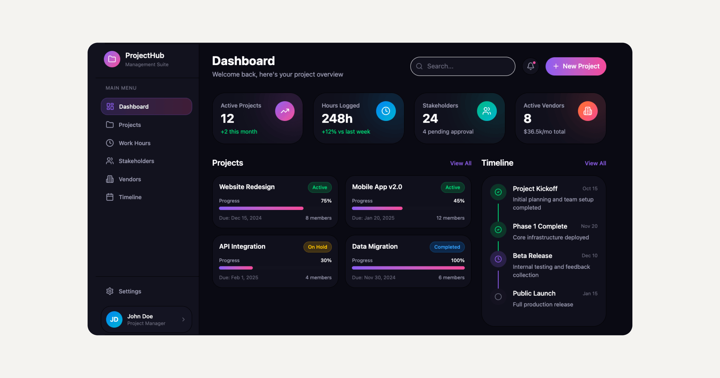
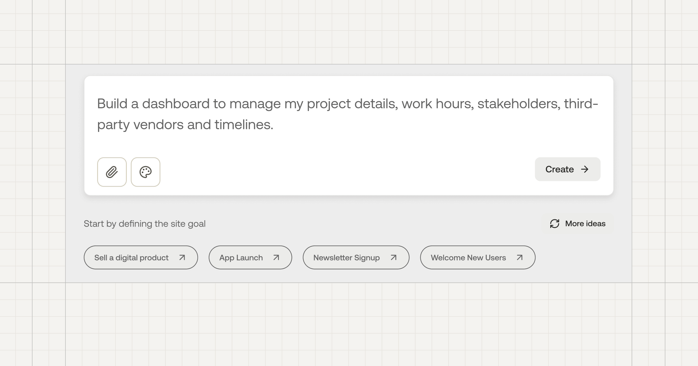
Professional web creators use Sticklight as their vibe-coding platform, built by the Elementor team and powered by Claude. It goes beyond websites, turning a plain-language prompt into a production-ready interface, whether that is a website, a web app, or a dashboard, then hands full control back to the creator on a visual canvas.
That handoff matters for UX and app development specifically. AI does the heavy lifting from the first prompt, generating a working structure and flow, but the person building the product keeps control of every pixel afterward. Flows can be adjusted and information architecture reorganized, without starting over.
Skills are the part of Sticklight built to bake proven practices into what gets shipped, each added with one click during the build phase. The design system Skill applies consistent spacing, typography, and component patterns. The accessibility Skill ships WCAG-aligned markup, focus states, and ARIA support. The onboarding Skill shapes a first-run experience instead of dropping new users into an empty screen. The micro-interactions Skill adds the small responsive details that make an interface feel considered rather than static.
A founder without a dedicated UX team can ship an app that reflects real UX discipline, and a design-led team can move faster without re-deriving best practices on every project. Sticklight also connects to and extends an existing WordPress or Elementor site, so teams already building there can bring the same UX standard to new apps and tools.
Building software used to require a team and a budget. Now it mostly requires patience, a clear head, and the discipline to test what you build.
Itamar Haim
Built by the Elementor team. Powered by Claude.
Let it glow.