Vibe coding examples and how to get started (2026)

Vibe coding examples are working products, not proofs of concept. A landing page, a dashboard, a booking tool, a form tied to a database, a small SaaS app, a portfolio site: each one gets built by describing what you want in plain language and refining it through conversation, instead of writing every line by hand. You state the outcome, the AI generates a working draft, and you keep adjusting until it fits.
This guide walks through six common examples, with a sample prompt for each and what typically comes out the other end. It closes with a straightforward path to getting started on Sticklight, the vibe-coding platform built by the Elementor team and powered by Claude.
- Vibe coding means describing what you want in plain language and refining the result through conversation, not hand-coding every element from scratch.
- The most common vibe coding examples span landing pages, admin dashboards, booking tools, database-backed forms, small SaaS products, and portfolio sites.
- A useful prompt states the goal, the audience, and the must-have pieces, then gets sharpened in follow-up turns rather than written once and left alone.
- Good vibe coding does not stop at a demo. The output should be close to ready to publish, with real layout, real logic, and in several cases a real database.
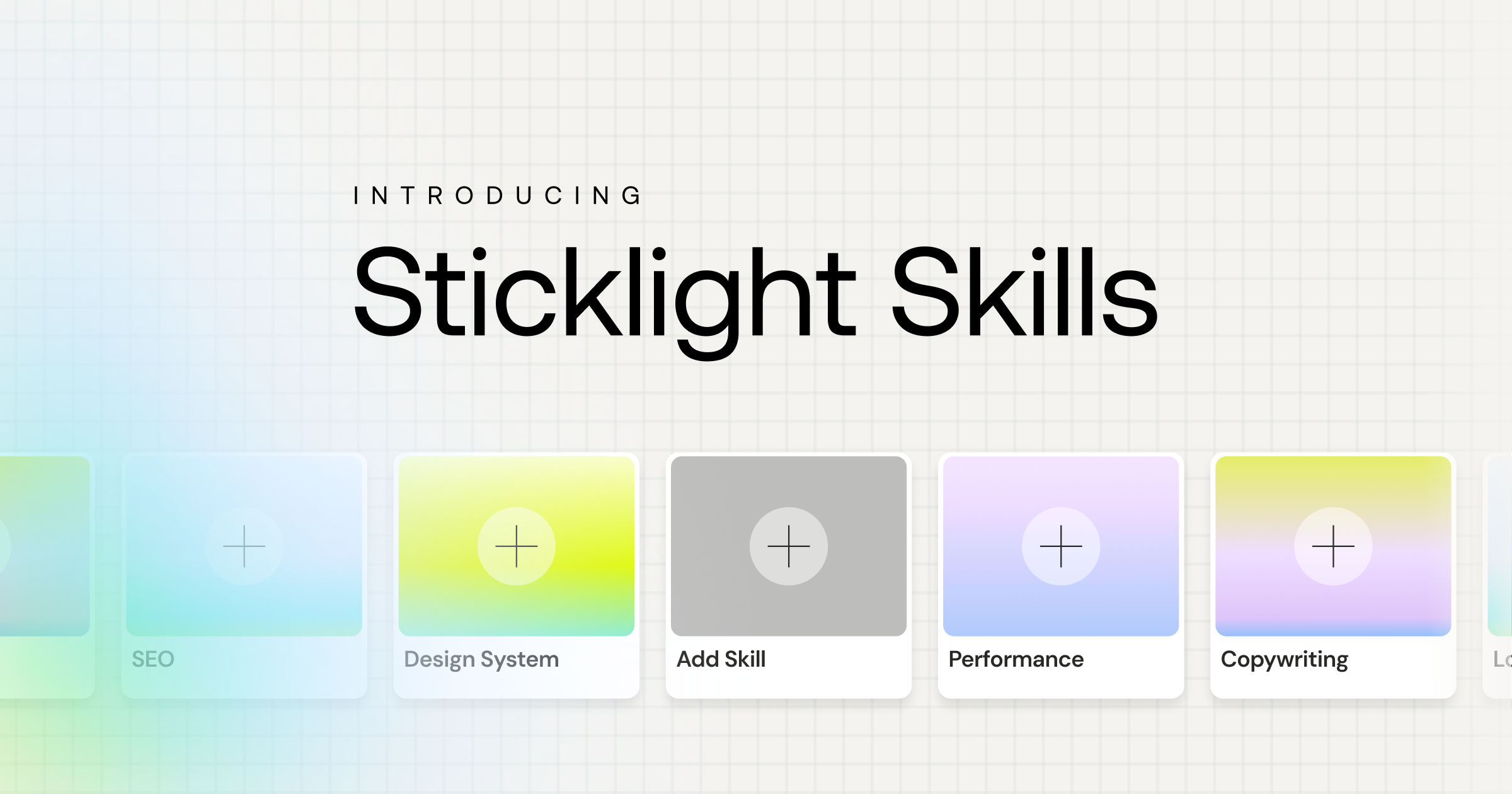
- Sticklight adds Skills, packaged expertise such as accessibility, SEO, and performance, to any prompt during the build phase.
- Getting started follows three steps: prompt, build, publish, with an existing WordPress or Elementor site available to connect to rather than replace.
What vibe coding examples actually look like
Vibe coding is the practice of building software by describing what you want in plain language, then refining the result through conversation rather than writing code line by line. You start with an intent, something like “I need a scheduling page for consultation calls,” and the AI produces a working draft. From there, you keep talking: change the colors, add a field, rearrange the layout, connect it to a calendar. The refining continues until the product matches what you had in mind.
The examples below all follow that shape. Each starts with a plain-language prompt and produces something closer to a finished product than a mockup: real layout, real logic, and in several cases a real database. What separates a workable example from a discouraging one is scope. Ask for an entire platform in one prompt and the result stays vague. Ask for one page or one flow, and you get something worth iterating on.
A marketing landing page
A landing page is often the first thing people try, since the goal is narrow: one page, one offer, one call to action.
Build a landing page for a productivity app targeting freelancers. Headline should focus on saving time on client admin. Include a hero section, three feature blocks, a pricing teaser, and a signup form.
What comes out is a structured page with real copy drafts, a working form, and a layout built toward conversion rather than a generic template stretched to fit. From there, refining is quick: swap the headline, reorder the feature blocks, tighten the copy. Because a landing page has few moving parts, it is a fast way to see how a vibe-coding prompt turns into something you can actually publish.
An internal admin dashboard
Dashboards are less about design polish and more about getting the right data on screen for the right people.
Build an internal dashboard that shows monthly recurring revenue, churn rate, and new signups, pulled from a table I will connect, with filters by month and by plan.
The output is a working screen: charts, filters, and a layout built around scanning numbers quickly rather than persuading a visitor. Teams use this pattern for RevOps, finance, and support reporting, where the audience is a handful of internal users, not the public. Because the stakes are internal, this is also a lower-pressure place to try vibe coding for the first time.
A booking or scheduling tool
Booking flows carry real logic behind them: availability, time zones, confirmations.
Build a booking page for 30-minute consultation calls. Show available slots for the next two weeks, collect name, email, and a short note, and send a confirmation once someone books.
What comes back is a functioning flow, not only a form. Slots update as they fill, confirmations go out, and the underlying schedule stays consistent. This kind of example is a good test of whether a vibe-coding tool can hold logic across a few connected steps, not just render a static page.
A data-capture form with a database behind it
Some prompts are really asking for two things at once: a form on the front end and a place for that data to live on the back end.
Build a form that collects name, company, email, and project budget, saves each submission to a database, and shows me a table of all submissions I can filter by budget range.
The difference between a toy and a real tool shows up right here. A working example produces a form, a database table, and a simple view of the stored data, connected end to end. That is the pattern behind lead-capture tools, intake forms, and small internal CRMs that teams build for themselves rather than buy.
A small SaaS MVP
An MVP is the most demanding example on this list, since it usually needs a few connected screens and a place to store user data.
Build a simple habit tracker. Users sign up, add habits, mark them done each day, and see a streak count. Keep it to a dashboard, an add-habit screen, and a settings page.
The result is a small but complete product: sign-up, a few connected screens, and data that persists between sessions. It will not stand in for months of custom engineering on a complex product, but for a focused idea with a handful of screens, it is enough to put in front of early users and learn from.
A portfolio or content site
Portfolio and content sites reward a different kind of prompt, one that leans on structure and tone rather than logic.
Build a portfolio site for a freelance photographer. Home page with a hero image grid, an about page, a contact form, and a gallery organized by shoot type.
What comes back is a structured, content-first site with pages that fit the content type, ready to fill in with real photos and bios. Because these sites lean on CMS-style structure more than custom logic, they are also a natural fit for layering on SEO and copywriting expertise on top of the base prompt.
How to get started with Sticklight
Getting started means taking a professional web creator beyond websites into apps, dashboards, and full digital products, on the vibe-coding platform built by the Elementor team and powered by Claude. It follows three steps: Prompt, Build, and Publish.
You start in the prompt box, or in Plan Mode if the project has a few moving parts worth mapping out first. During Build, you can add a Skill, packaged expertise such as accessibility, SEO, design system, performance, copywriting, localization, micro-interactions, or onboarding, to the same prompt with one click. Skills compound: a Skill you use on your first project makes every later one faster and sharper. You can also edit by hand at any point, down to the code on the canvas.
Publish adds SEO basics, a security scan, and the option to connect a custom domain. If you already run a site on WordPress or Elementor, Sticklight connects to it and extends it, rather than asking you to start over. A free plan lets you try the platform before moving to a paid plan as your needs grow. Agents, for handling more of the workflow on their own, is on the roadmap and not yet live.
There’s a real gap between people who ship and people who tinker, and it has nothing to do with skill. It comes down to whether they’ll finish the boring, unglamorous last stretch.
Itamar Haim
Built by the Elementor team. Powered by Claude.
Let it glow.