What Is Responsive Design?

Responsive design is an approach to building websites so that layout, text, images, and navigation automatically adjust to fit whatever screen they’re displayed on, from a small phone to a wide desktop monitor. Instead of maintaining separate versions of a site for mobile, tablet, and desktop, developers build one flexible layout that reshapes itself in real time based on the available screen width, so every visitor gets a version of the page built for their device.
The approach grew popular in the early 2010s as smartphones and tablets multiplied the number of screen sizes designers had to support, replacing the older habit of building a separate mobile site at a different address. Today it’s considered baseline practice for any professional site. Pages need to work well whether someone opens them on a compact phone, a laptop, or a large monitor, without pinching, zooming, or scrolling sideways to read a sentence.
How responsive design works
At its core, responsive design relies on fluid grids. Rather than fixing element widths in pixels, developers size columns, images, and spacing using relative units such as percentages, em, or viewport units. That means a two column layout can stretch or shrink smoothly as the browser window changes size, keeping proportions consistent instead of breaking apart or overflowing at odd widths in between the sizes a designer originally tested.
Media queries are the CSS rules that let a design respond to its context. They check conditions such as screen width and apply different styles once a threshold, called a breakpoint, is crossed. A typical setup switches from a single stacked column on phones to a multi column layout on tablets and desktops, so one set of page code serves every device without a separate build for each.
Why responsive design matters
Most web traffic today arrives from mobile devices, so a site that only looks right on desktop turns away a large share of visitors before they read a word. Responsive design keeps content readable, images sized correctly, and buttons easy to tap on any screen, which lowers bounce rates and supports better search rankings, since search engines favor pages that perform well on mobile.
It also simplifies ongoing maintenance. One responsive codebase replaces the older pattern of separate mobile and desktop sites, so updates, fixes, and new content only need to happen in one place. For teams publishing regularly, that single source of truth saves real time and avoids pages quietly falling out of sync with each other as a business grows.
Responsive design vs adaptive design
Responsive design uses one fluid layout that adjusts continuously to any screen size, using percentages and breakpoints to reshape itself in between. Adaptive design takes a different route. It builds several fixed layouts, each tailored to a specific screen width, and serves the version closest to the visiting device. Both approaches aim for a good fit on every screen, just through different underlying mechanics.
In practice, responsive design has become the more common choice, since it handles the huge range of modern screen sizes without maintaining multiple fixed versions of a page. Adaptive design can still make sense when redesigning a legacy site in careful stages, or when serving a distinctly different experience to one known device type.
Best practices for responsive design
Good responsive work starts with a mobile first mindset, designing for the smallest screen first and adding complexity as space allows rather than shrinking a desktop layout down. Testing on real devices, not just a resized browser window, catches spacing and touch target issues that simulators often miss. A few habits keep layouts solid across every screen size a site is likely to meet:
- Use relative units like percentages, rem, and viewport width instead of fixed pixels
- Set breakpoints where the content itself starts to break, not just at standard device widths
- Compress and resize images so pages load quickly on mobile connections
- Keep buttons and links large enough to tap comfortably on a small screen
Where Sticklight fits
Elementor and WordPress remain a strong foundation for building responsive sites, giving teams full control over grids, breakpoints, and every design detail described above. Sticklight adds another path to the same result. It’s a vibe coding platform by the Elementor team that turns a written prompt into a production ready website, with responsive design built in from the very first draft, no manual breakpoint tuning required.
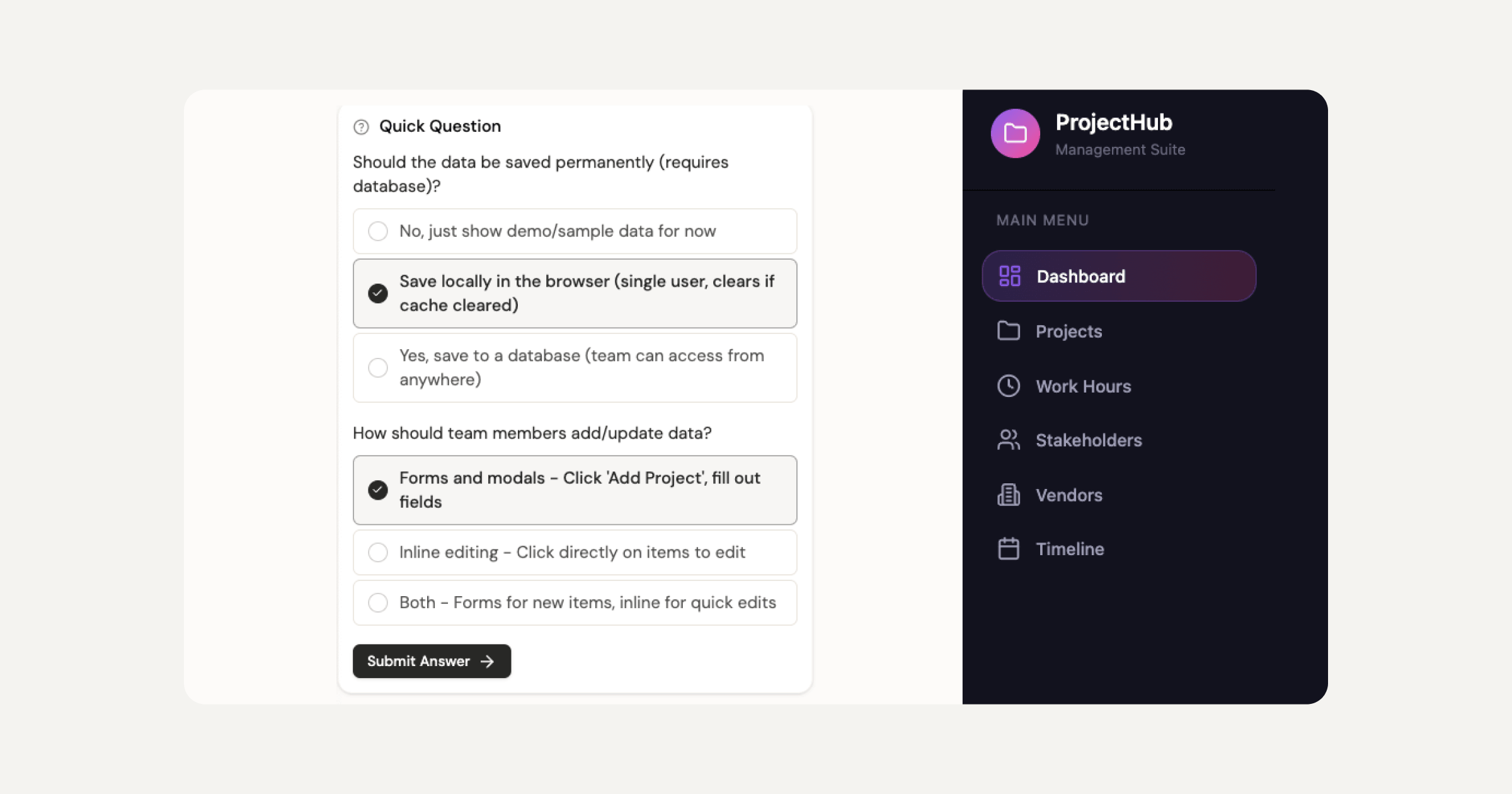
That means the fluid grids, media queries, and mobile friendly layouts covered in this article don’t have to be assembled by hand every time a new site is needed. A creator describes what they want, and Sticklight generates a site that already works cleanly on every screen, from phone to desktop, ready to refine further using the familiar tools around it.
Frequently asked questions
What is responsive design?
Responsive design is an approach to building websites so they adapt to any screen size, from phones to large monitors. The layout, images, and text adjust automatically so the site stays readable and usable.
How does responsive design work?
Responsive design uses flexible grids, fluid images, and CSS media queries to change the layout at different screen widths, called breakpoints, so content rearranges to fit the device.
Why is responsive design important?
Most web traffic comes from mobile devices, so a site that adapts to every screen reaches more people, is easier to use, and tends to perform better in search results.
What is a breakpoint in responsive design?
A breakpoint is a screen width where the layout changes, such as switching from a multi-column desktop view to a single-column mobile view, so content stays readable.
What is the difference between responsive and adaptive design?
Responsive design uses fluid layouts that flex to any width, while adaptive design uses a set of fixed layouts chosen for specific screen sizes.
Built by the Elementor team. Powered by Claude.
Let it glow.