Luma
# Luma (EN)
> Identity DNA. Injected once into Remix context. Top-down weight.
---
## 1. Soul
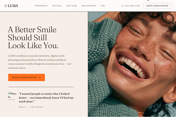
Warm cream paper and cocoa-brown ink under a whisper of grain, ruled into a lattice of hairline cells so the page reads as a clinical worksheet drawn by an art director. One serif does every job, headline and body alike, with a small mono face reserved for the tracked-out labels that number and title each band. Burnt-orange coral arrives as the single loud voice: one section flooded with it, every primary button filled with it, and a custom cursor that swells into a coral disc carrying a word. Photography is high-key macro on skin, freckles and texture at close range, with a faint measuring grid and a smile curve laid over the hero like a planning overlay. Everything enters through a mask, rising or unclipping upward, on one shared easing. Craft made legible.
---
## 2. Character Traits
Operational rules of identity.
**1. One serif does everything.** Fraunces is bound to `--font-sans`, `--font-serif` and `--font-gelica` simultaneously, and `body` sets it directly. Headlines, body copy, review text, patient names, the wordmark, all Fraunces. Geist exists only as `--font-mono` for micro labels. Reaching for a sans body face = fail; there is not one in the system.
**2. Weight and size carry hierarchy, since the family never changes.** Headlines run `font-light` or `font-normal` at `leading-[1]` to `1.16` with `tracking-[-0.01em]`. Body sits at `15px` to `17px` in `text-ink-soft`. The difference between a heading and a paragraph is scale and weight only.
**3. Mono labels are the connective tissue.** `MonoLabel` is `font-mono text-[11px] uppercase leading-none tracking-[0.16em] text-ink-soft`, and a variant of it opens almost every band. Tracking ranges `0.12em` on nav to `0.24em` on the dark statement. They number things, name treatments, and credit patients. A section without a mono label above its headline = fail.
**4. Hairline cells rule the page.** `--color-border` is the ink itself, `#2b1a07`, and nearly every section carries `border-b border-border`. Splits divide with `md:border-r`, list rows with `border-b`, the reviews grid draws its own lattice with `gap-px` over a `bg-border` parent. Layout is a ruled sheet.
**5. Coral is the one loud voice, used three ways only.** `#ff6f1e` fills primary buttons, floods exactly two full sections as a background, and colors the cursor. `--color-coral-deep` `#ce500a` is the hover and the accent for small icons and active states. It never tints body text and never appears as a third or fourth decorative fill. A coral heading = fail.
**6. Two sections invert the page.** `IntroStatement` and the footer go `bg-ink text-chalk`, and `PatientStory` goes `bg-coral`. Those three inversions are the page's entire rhythm. Adding a fourth inverted band flattens the effect.
**7. Everything enters upward through a mask.** The four primitives all move in one direction: `Reveal` rises `24px`, `StaggerItem` rises `24px` on a `0.08s` gap, `RevealHeading` slides each line from `y: '112%'` inside an `overflow-hidden` wrapper, `RevealImage` unclips from `inset(100% 0 0 0)` with a `1.05 → 1` settle. Nothing fades in place and nothing enters from the side.
**8. One easing, exported as a constant.** `EASE = [0.16, 1, 0.3, 1]`, mirrored in the theme as `--ease-editorial`. Durations come from three tokens: `200ms`, `400ms`, `800ms`, with images at `1.1s` and the hero at `1.3s`. A default ease anywhere = fail.
**9. The cursor is a component of the brand.** Desktop only, gated on `(pointer: fine)`. At rest it is a `10px` ink dot at 70% opacity. Over any interactive element it becomes a `12px` coral dot. Over an element carrying a `data-cursor` string it swells to a `68px` coral disc holding that word in mono caps. Spring is `stiffness: 450, damping: 38, mass: 0.4`. Every interactive element in the page carries a `data-cursor` attribute, even an empty one.
**10. Grain sits over everything.** A fixed `z-[60]` layer at `opacity-[0.03]` with `mix-blend-multiply`, carrying inline SVG `feTurbulence` at `baseFrequency='0.82'` tiled at `180px`. It is what stops the cream reading as flat digital paper.
**11. The hero photograph carries a planning overlay.** Over the image sit four things in order: a `bg-coral/15 mix-blend-multiply` tint, an SVG with a `64px` grid at `0.5` stroke, a dashed vertical centerline, and a shallow smile curve `M20 78 Q50 92 80 78`, then a bottom scrim, then a mono caption reading a study number. This composite is the brand's clinical signature. A bare photograph in the hero = fail.
**12. Radius is small and consistent.** `4px` on every button and field, `6px` on the reviews lattice, `2px` on the mobile hero frame. `--radius-sm` is `4px`, `md` `8px`, `lg` `12px`. Nothing is pill-shaped except the cursor. A `rounded-full` button or a `rounded-2xl` card = fail.
**13. Interactive rows shift sideways on hover.** The pattern recurs: treatment buttons gain `hover:px-3`, WhyLuma titles slide `group-hover:translate-x-2` while their number turns coral-deep and their copy goes from `opacity-60` to full, arrows nudge `translate-x-1`. Motion on hover is horizontal, never a lift or a shadow.
---
## 3. Refusals
**No second type family for content.** One serif carries headline and body. Geist is for labels only.
**No pure black and no pure white.** The paper is `#fdfbf9` and the ink is `#2b1a07`, a warm near-black brown. `--color-true-black` and `--color-charcoal` are defined and go unused in the page.
**No coral on type.** Coral fills and highlights. Headings and body stay ink or chalk.
**No third accent in the interface.** Lavender, stone and sage exist as quiet section grounds. The sky, bubblegum and sprout sticker tokens are defined and unused; leave them unused.
**No shadows in the layout.** Four shadow tokens exist and the page applies one, `shadow-2xl`, on the mobile-only hero frame. Everywhere else separation is a hairline. Adding `shadow-md` to a card = fail.
**No pill buttons.** Everything is a `4px` rectangle.
**No downward or sideways entrances.** Content rises or unclips upward. Always.
**No cursor without a label contract.** Any element the cursor should react to carries `data-cursor`. Elements that should not react carry nothing.
**No motion that survives `prefers-reduced-motion`.** Every primitive swaps its transform for a plain opacity change via `useReducedMotion`, the count-up jumps to its final value, and the auto-advancing story carousel stops entirely.
---
## 4. Anatomy of a Page
One long scrolling page, twelve sections, with `main` offset by `pt-20` to clear the fixed header.
`Grain` → `CustomCursor` → `Header` → `Hero` → `TrustStrip` → `IntroStatement` → `Treatments` → `PatientStory` → `Testimonial` → `Reviews` → `Doctor` → `PatientInfo` → `WhyLuma` → `Faq` → `Contact` → `Footer`.
Note the render order differs from the import order: `WhyLuma` sits after `PatientInfo`, not before it.
1. **Header.** `fixed inset-x-0 top-0 z-50 border-b border-border bg-chalk/95 backdrop-blur-sm`, height animating `h-20` to `h-16` past `scrollY > 24` over `300ms`. Left is a `rotate-45` bordered square beside the wordmark at `text-2xl`. Center is mono nav. Right is a phone number and an outlined book link. Mobile swaps to a coral Book chip plus a burger opening a full-height `bg-chalk` panel of serif rows.
2. **Hero.** `md:min-h-[calc(100vh-5rem)]`, two columns with `md:border-r` between them. Left is `bg-ivory` carrying a three-line masked headline, a paragraph, one coral CTA, and a bordered patient quote with a `56px` thumbnail. Right is `bg-coral` holding the photograph with its planning overlay. Order flips on mobile so the image comes first.
3. **TrustStrip.** A thin `py-10` band, mono label left, five accreditation names right set in serif at `text-ink/35` brightening to `/60` on hover.
4. **IntroStatement.** Full `min-h-screen` on `bg-ink text-chalk`. A centered mono label, a centered serif statement, a text link, then four parallax images pushed to the bottom with `mt-auto`.
5. **Treatments.** Two columns: a crossfading image panel left, an accordion list right.
6. **PatientStory.** `bg-coral` with a `58px` grid overlay at `opacity-[0.5]`, holding tabs, a bordered two-column card, and count-up metrics.
7. **Testimonial.** A 12-column split, `bg-lavender` image panel on `lg:col-span-5` ordered second, a large quote on `col-span-7` ordered first.
8. **Reviews.** `bg-stone`. Header row with a headline left and a star rating plus review count right, then the `gap-px` review lattice.
9. **Doctor.** 12-column split, bordered portrait on 1 to 5, then a mono label, a name, a three-line masked headline and biography on 7 to 12.
10. **PatientInfo.** Three staggered columns, each opening with a `coral-deep` lucide icon over a `border-t border-ink/15`, closed by one coral CTA.
11. **WhyLuma.** Six numbered rows at `min-h-[180px] md:min-h-[210px]` in a 12-column grid: number on 1, title on 2 to 6, copy on 7 to 11, a hover-revealed arrow on 12.
12. **Faq.** 12-column split with a `lg:sticky lg:top-28` heading block on 1 to 4 and an eight-item accordion on 5 to 12. The open item takes `bg-stone/60`.
13. **Contact.** Two columns. Left is `bg-ivory` with the heading, a confirmation note, the form, and two outlined contact chips. Right holds a four-cell detail grid over an embedded Google map.
14. **Footer.** `bg-ink text-chalk`, a 12-column grid, wordmark and description on 1 to 4, then link columns.
**Vertical rhythm.** Section padding is `py-24 md:py-32` almost everywhere, with the TrustStrip compressed to `py-10` and the hero running `pt-32 md:pt-40` on desktop. Horizontal padding is `px-5 sm:px-8`, opening to `lg:px-16` in split cells.
**What never appears:** a shadowed card, a pill button, a carousel with dots, a countdown, a price, a second route with content, or a light and dark toggle.
---
## 5. Colors
`src/theme.css`, Tailwind v4 `@theme`. `body` also sets the background and color directly.
**Warm paper neutrals**
| Token | Hex | Role |
|---|---|---|
| `--color-chalk` | `#fdfbf9` | The page base |
| `--color-ivory` | `#f7efe9` | Hero copy cell, contact form cell |
| `--color-stone` | `#efe4db` | Reviews ground, open FAQ row at `/60` |
| `--color-stone-deep` | `#e6d8cc` | Deeper neutral |
| `--color-ink` | `#2b1a07` | Warm near-black brown. Text, dark sections, and every border |
| `--color-ink-soft` | `#7c6a56` | Body copy and mono labels |
**Accents**
| Token | Hex | Role |
|---|---|---|
| `--color-coral` | `#ff6f1e` | Primary buttons, two section grounds, the cursor |
| `--color-coral-deep` | `#ce500a` | Hover fill, small icons, active accordion state |
| `--color-coral-soft` | `#ffd8bf` | Soft tint |
| `--color-lavender` | `#f2e6da` | Testimonial image panel |
| `--color-lavender-deep` | `#e8d6c4` | Deeper tint |
| `--color-sage` | `#e2efe0` | Quiet ground |
**Named brand tokens, defined and mostly unused.** `cream-paper`, `dew-drop`, `charcoal` `#171717`, `cocoa-ink` `#2b1a07`, `true-black` `#000000`, `marker-orange`, `burnt-sienna`, `sky-sticker` `#3b82f6`, `bubblegum-sticker` `#ff66cf`, `sprout-sticker` `#22c55e`, `shadow-mist` `#bebcbb`. Keep them defined; the sticker colors in particular belong to a lineage this template inherits and should not be introduced into the page.
**The border token is the ink.** `--color-border` and `--color-input` are both `#2b1a07`. Every hairline in the page is full-strength ink, which is why the lattice reads as drawn rather than as a subtle divider. Softening borders to a grey = fail.
**Radius.** `sm 4px`, `md 8px`, `lg 12px`, `full 9999px`.
**Shadows.** `sm` through `xl` defined as warm ink alphas, `0 1px 2px #2b1a070f` up to `0 24px 60px #2b1a0729`. Used once, on the mobile hero frame only.
---
## 6. Typography
Two families from Google Fonts, preconnected in `index.html`.
```css
--font-sans: 'Fraunces', Georgia, 'Times New Roman', serif;
--font-serif: 'Fraunces', Georgia, 'Times New Roman', serif;
--font-gelica: 'Fraunces', Georgia, 'Times New Roman', serif;
--font-mono: 'Geist', system-ui, sans-serif;
--font-geist: 'Geist', system-ui, sans-serif;
```
Fraunces stands in for a licensed face called gelica, loaded at weights 300 to 700 with optical sizing 9 to 144. Geist loads at 400, 500, 600. Note that `--font-sans` resolving to a serif is intentional, so `font-sans` and `font-serif` are interchangeable in class strings.
| Tier | Size | Weight | Leading |
|---|---|---|---|
| Hero h1 | `text-[2.9rem] md:text-[2.5rem] lg:text-[clamp(3.3rem,4.6vw,5.4rem)]` | light | `0.94` |
| Dark statement | `text-[1.7rem] sm:text-4xl md:text-[2.9rem]` | light | `1.16` |
| Big quote | `text-3xl sm:text-[2.9rem]` | light | `1.1` |
| Section h2 | `text-3xl sm:text-4xl` or `text-4xl sm:text-5xl` | light or normal | `1.02` to tight |
| Story quote | `text-3xl sm:text-[2.4rem]` | light | `1.08` |
| WhyLuma title | `text-3xl sm:text-4xl md:text-[2.5rem]` | light | `1.02` |
| Count-up figure | `text-4xl sm:text-5xl` | default | `none` |
| Treatment name | `text-2xl sm:text-3xl` | default | default |
| Body | `15px` to `17px` | default | `relaxed` |
| Mono label | `10px` to `13px` | 400 to 600 | `none`, tracked `0.12em` to `0.24em` |
Display tracking is `-0.01em` throughout, with the hero at `-0.01em` and a `-3px` left nudge plus a negative top margin to optically align the cap to its cell.
Italic appears once, on the hero patient quote at `text-[19px] italic`.
---
## 7. Layout
Most sections use a bare `mx-auto` with no max-width, so content spans the viewport inside `px-5 sm:px-8`. Two exceptions cap: `PatientStory` at `max-w-[1240px]` and `IntroStatement` at `max-w-[1400px]`. Twelve-column grids handle every asymmetric split, and the column spans are deliberate: 5 and 6 starting at 7 for the doctor, 4 and 8 for the FAQ, 5 and 7 for the testimonial, 1 / 5 / 5 / 1 for the WhyLuma rows.
Two sections are viewport-scale: the hero at `md:min-h-[calc(100vh-5rem)]` and the dark statement at `min-h-screen`.
---
## 8. Shapes
Small-radius rectangles, `4px` for controls and `6px` for the reviews lattice. The recurring marks are the `rotate-45` bordered square in the wordmark, thin lucide icons at `strokeWidth={1.5}` or `1.25`, the `h-px w-8` rule beside the hero study caption, and the SVG planning overlay. The cursor is the only circle in the system.
---
## 9. Elevation & Depth
Depth is section-ground alternation plus full-strength ink hairlines. Cream, then cream, then ink, then cream, then coral, then lavender, then stone, then cream. The grain layer flattens everything into one surface. The single `shadow-2xl` in the page appears on the mobile hero frame, where the image floats on coral without a cell to sit in.
---
## 10. Components
| Component | Role |
|---|---|
| `Grain` | Fixed `z-[60]` noise overlay |
| `CustomCursor` | Desktop dot that swells into a labelled coral disc |
| `Header` | Fixed hairline bar, height-shrinking, mobile panel |
| `motion.tsx` | `Reveal`, `Stagger`, `StaggerItem`, `RevealHeading`, `RevealImage`, `EASE` |
| `ui.tsx` | `MonoLabel`, `CTA` with solid, outline and ghost variants |
| `lib/practice.ts` | Single source of truth for name, phone, email, address, hours, map embed |
| Sections | Twelve, listed in section 4 |
**CTA.** `group inline-flex items-center gap-3 px-7 py-4 font-mono text-[12px] uppercase tracking-[0.14em] transition-colors duration-300 rounded-[4px]` with a trailing `ArrowRight` nudging `group-hover:translate-x-1`. Solid is `bg-coral text-ink hover:bg-coral-deep hover:text-chalk`, so hovering the coral button darkens it and flips the label to cream. Outline is `border border-ink/25 hover:bg-ink hover:text-chalk`. Ghost is text going `hover:text-coral-deep`.
**Form field.** `w-full rounded-[4px] border border-border bg-chalk px-4 py-3 text-[15px] text-ink outline-none transition-colors placeholder:text-ink-soft/60 focus:border-ink`. Fields sit on chalk inside the ivory cell.
**Accordion row.** `border-b border-border`, a full-width button at `py-6` or `py-7`, and an `AnimatePresence` block animating `height: 0 → 'auto'` with opacity over `0.45s` to `0.5s`. Treatments swap an `ArrowRight` for a `rotate-45` coral-deep `Plus`; the FAQ swaps `Plus` for `Minus`.
**Reviews lattice.** `grid gap-px overflow-hidden rounded-[6px] border border-border bg-border` with each cell `bg-chalk p-8`. Same technique as a ruled table with no doubled lines.
---
## 11. Signature Moments
### Moment 1. The clinical planning overlay on the hero
**Effect.** The hero photograph reads as a case study rather than a stock smile: a faint measuring grid, a dashed centerline through the face, a shallow curve tracing the smile line, and a small caption numbering the study.
**Mechanic.** Five layers stacked inside the image cell in this order. The image, animating in via clip-path. A `bg-coral/15 mix-blend-multiply` tint that warms the photograph into the palette. The SVG overlay. A bottom scrim at `h-28 bg-gradient-to-t from-ink/70`. Then the caption.
```tsx
function PlanningOverlay() {
return (
<svg aria-hidden className="pointer-events-none absolute inset-0 h-full w-full text-chalk" preserveAspectRatio="none">
<defs>
<pattern id="hero-grid" width="64" height="64" patternUnits="userSpaceOnUse">
<path d="M64 0H0V64" fill="none" stroke="currentColor" strokeWidth="0.5" opacity="0.35" />
</pattern>
</defs>
<rect width="100%" height="100%" fill="url(#hero-grid)" opacity="0.25" />
<line x1="50%" y1="0" x2="50%" y2="100%" stroke="currentColor" strokeWidth="0.75" opacity="0.3" strokeDasharray="2 8" />
<path d="M20 78 Q50 92 80 78" fill="none" stroke="currentColor" strokeWidth="0.75" opacity="0.4"
vectorEffect="non-scaling-stroke" style={{ transformBox: 'fill-box' }} />
</svg>);
}
```
```tsx
<div className="absolute inset-0 bg-coral/15 mix-blend-multiply" aria-hidden />
<PlanningOverlay />
<div className="pointer-events-none absolute inset-x-0 bottom-0 h-28 bg-gradient-to-t from-ink/70 to-transparent" aria-hidden />
<div className="absolute bottom-5 left-5 flex items-center gap-3">
<span className="h-px w-8 bg-chalk/70" />
<span className="font-mono text-[10px] uppercase tracking-[0.16em] text-chalk/80">Smile Study / 001</span>
</div>
```
**This is NOT a decorative pattern and NOT a full-strength grid.** The opacities are compounded on purpose, `0.35` on the path inside a rect drawn at `0.25`, so the grid is barely there. Drawing it at readable strength turns an art-directed clinical hint into graph paper. The coral tint at `/15` under `mix-blend-multiply` is what stops the photograph looking imported.
### Moment 2. The custom cursor that becomes a label
**Effect.** A small ink dot follows the pointer with slight lag. Over a link it turns coral and shrinks. Over an element that declares a word, it swells into a large coral disc with that word set inside it.
**Mechanic.** Motion values fed through springs at `stiffness: 450, damping: 38, mass: 0.4`. On every `mousemove` the handler runs `closest('[data-cursor]')` on the event target and reads the attribute. Three visual states are driven by two booleans, with the size and color transitioning over `300ms`.
```tsx
const sx = useSpring(x, { stiffness: 450, damping: 38, mass: 0.4 });
const sy = useSpring(y, { stiffness: 450, damping: 38, mass: 0.4 });
const el = (e.target as HTMLElement | null)?.closest('[data-cursor]') as HTMLElement | null;
if (el) { setLabel(el.getAttribute('data-cursor') || ''); setActive(true); }
else { setActive(false); setLabel(''); }
// three states, in order of precedence
showLabel ? 'h-[68px] w-[68px] bg-coral text-[10px] text-ink'
: active ? 'h-3 w-3 bg-coral text-[0px]'
: 'h-2.5 w-2.5 bg-ink/70 text-[0px]'
```
The whole component returns `null` unless `(pointer: fine)` matches, and the wrapper is `hidden md:block` as a second guard. Note that `text-[0px]` rather than conditional rendering is what lets the label size animate rather than pop.
**The contract matters as much as the component.** Every interactive element in the page carries `data-cursor`, most with an empty string, which activates the coral dot state without a label. A remix that adds a button without the attribute produces a cursor that ignores it. Populate the attribute with a word only where a verb is useful.
### Moment 3. Four masked entrance primitives, all moving upward
**Effect.** Content arrives from below: paragraphs rise, list rows rise in sequence, headline lines slide up one at a time from behind their own edge, and images unclip from the bottom up while settling out of a slight scale.
**Mechanic.** Four components in `motion.tsx`, all sharing `EASE` and all branching on `useReducedMotion` to a plain opacity change.
```tsx
export const EASE = [0.16, 1, 0.3, 1] as const;
// Reveal, 0.8s, y 24
initial={reduce ? { opacity: 0 } : { opacity: 0, y }}
whileInView={{ opacity: 1, y: 0 }}
viewport={{ once, margin: '0px 0px -12% 0px' }}
transition={{ duration: 0.8, ease: EASE, delay }}
// Stagger, container variants, 0.08s gap; StaggerItem 0.7s, y 24
variants={{ hidden: {}, show: { transition: { staggerChildren: gap, delayChildren: delay } } }}
// RevealHeading, each line in a <span className="block overflow-hidden pb-[0.04em]">
initial={reduce ? { opacity: 0 } : { y: '112%' }}
whileInView={reduce ? { opacity: 1 } : { y: '0%' }}
transition={{ duration: 0.9, ease: EASE, delay: delay + i * 0.09 }}
// RevealImage, 1.1s
initial={reduce ? { opacity: 0 } : { clipPath: 'inset(100% 0 0 0)', scale: 1.05 }}
whileInView={reduce ? { opacity: 1 } : { clipPath: 'inset(0% 0 0 0)', scale: 1 }}
```
Two details that get dropped: the `pb-[0.04em]` on each heading line wrapper, which keeps descenders from being clipped by the mask, and the `112%` overshoot past 100 that guarantees the line starts fully clear.
**This is NOT a fade-in library.** Direction is part of the identity. An `x` offset, a scale-up, or a plain opacity fade on content = fail.
### Moment 4. Treatments, a crossfading panel against an accordion
**Effect.** A list of six treatments. Opening one expands its detail and simultaneously crossfades the large image beside it.
**Mechanic.** A single `active` index drives both halves. All six images are mounted absolutely in the panel at once and toggled by inline `opacity` with `transition-opacity duration-700 ease-out`, so the crossfade is a genuine dissolve with no flash. The list uses `AnimatePresence` on `height`.
```tsx
// All six mounted, opacity-driven
className="absolute inset-0 h-full w-full object-cover transition-opacity duration-700 ease-out"
style={{ opacity: active === i ? 1 : 0 }}
```
Closed titles sit at `text-ink/45` and brighten to full on hover; the open title is full ink. The affordance glyph swaps an `ArrowRight` that nudges for a `Plus` rotated `45deg` in `coral-deep`. The button gains `hover:px-3`, so the row shifts right under the pointer.
**This is NOT `AnimatePresence` on the image.** Mounting one image at a time produces a gap or a flash on swap. All six stay mounted.
### Moment 5. Patient stories, auto-advancing tabs with count-up metrics
**Effect.** Three patient stories cycle every three seconds. The portrait crossfades, the quote swaps upward, the underline glides between tabs, and three large figures count up from zero.
**Mechanic.** A `setInterval` at `3000ms` advancing the index, cleared and never started under reduced motion. The portrait uses `AnimatePresence mode="wait"` keyed on the image with a `0.6s` opacity crossfade; the quote uses the same pattern keyed on the text with a `y: 12 → 0 → -12` pass at `0.45s`. The active tab underline is a `motion.span` with `layoutId="story-underline"`, so Framer animates it between tabs rather than fading two spans.
The count-up is its own `requestAnimationFrame` loop over `1000ms` with an inline easeOutCubic, re-firing every time the element re-enters view because `useInView` is set to `once: false`.
```tsx
const inView = useInView(ref, { once: false, margin: '-15%' });
const p = Math.min(1, (now - start) / duration); // duration 1000
setDisplay(Math.round(value * (1 - Math.pow(1 - p, 3)))); // easeOutCubic
```
**Two things carry the character.** The `layoutId` underline, which a Remix will replace with a static border and lose the glide. And the fact that one metric per story is deliberately `0`, so the count-up lands on nothing: `0 Obvious-looking dentistry`, `0 Enamel removed`. The zero is the joke and the proof.
### Moment 6. The dark statement with parallax collage
**Effect.** A full-viewport ink section with a centered statement, and four portraits along the bottom drifting at different rates as you scroll.
**Mechanic.** `useScroll` on the collage wrapper with `offset: ['start end', 'end start']`, feeding four separate `useTransform` outputs with deliberately mismatched ranges and one reversed direction.
```tsx
const y1 = useTransform(scrollYProgress, [0, 1], [120, -120]);
const y2 = useTransform(scrollYProgress, [0, 1], [-40, 40]); // reversed
const y3 = useTransform(scrollYProgress, [0, 1], [180, -180]);
const y4 = useTransform(scrollYProgress, [0, 1], [20, -100]);
```
Each image also carries a different static top margin at `lg`, `mt-24`, `mt-40`, `mt-28`, `mt-8`, so the row is already ragged before it moves. On mobile the grid becomes a `snap-x snap-mandatory` horizontal scroller at `w-[68%]` with the scrollbar hidden.
**The second axis being reversed is the point.** Four rates in the same direction read as one plane moving; one going the other way makes the group feel loose.
### Moment 7. WhyLuma rows
Six numbered rows, each `min-h-[180px] md:min-h-[210px]` so they read as tall bands rather than list items. On hover three things happen together over `500ms`: the number turns `coral-deep`, the title slides `translate-x-2`, and the copy goes `opacity-60` to full. A `coral-deep` `ArrowUpRight` slides in from `-translate-x-3` and `opacity-0` in the last column.
---
## 12. Flex Axes
**Subject.** Cosmetic dentistry ships today. The system carries any high-consideration practice or service sold on craft and reassurance: dermatology and aesthetics, orthodontics, fertility, physiotherapy, hearing, optometry, a surgical practice, or a specialist clinic of any kind. **Cannot shift:** there must be a treatment list worth accordioning, patient outcomes worth quoting, and a reason to look closely at skin or material.
**The neutral pair.** Cream and warm brown-black swap for another warm paper and warm ink. **Cannot shift:** the border token equals the ink, so hairlines are always full strength.
**The loud accent.** Coral can become any single saturated warm or cool hue. **Cannot shift:** it appears as button fills, exactly two section grounds, and the cursor. Never on type, never as a third decorative fill.
**The planning overlay.** The grid, centerline and smile curve are dentistry-specific. Translate the curve to the discipline: a jawline, a spine, a lens diagram, a growth chart, a waveform. **Cannot shift:** the compounded low opacities, the coral tint under `mix-blend-multiply`, and the numbered study caption.
**Section count and order.** Twelve sections ship. A remix can trim to eight or extend, and must keep the three inversions, one accordion, one auto-advancing story block, and the numbered row list.
**Metric set.** Three figures per story, one of them zero. Counts can change; the zero should not.
**Voice.** Reassurance through specificity, often with the objection stated first. `A Better Smile Should Still Look Like You.` `Loved By People Who Hate Looking Like They Tried.` `The Goal Isn't Perfect Teeth. It's The Right Teeth.` Copy names the fear the reader arrived with and answers it in the same breath. Mono labels are clipped technical fragments: `Ceramic / 6-8 Units`, `Additive / Reversible`, `Smile Study / 001`. A benefit-led or superlative headline = fail.
---
## 13. Anti-Slop Self-Check
1. Is every heading and every paragraph set in the same serif, with Geist appearing only on uppercase micro labels? Required. A sans body face = fail.
2. Do `--font-sans`, `--font-serif` and `--font-gelica` all resolve to the same serif? Required, this is intentional.
3. Zero `#000000` and zero `#ffffff` as a surface or text color? Required. The paper is `#fdfbf9`, the ink `#2b1a07`.
4. Does `--color-border` compute to the full-strength ink `#2b1a07`, and does nearly every section close with `border-b border-border`? Required. Grey borders = fail.
5. Does coral appear only as button fills, exactly two section grounds, and the cursor? Required. Coral type or a third coral fill = fail.
6. Are exactly three sections inverted, two on ink and one on coral? Required.
7. Do all radii resolve to `4px`, `6px`, `8px`, `12px`, or the `2px` mobile hero frame? Required. A `rounded-full` button = fail.
8. Is `box-shadow` `none` everywhere except the mobile-only hero frame? Required.
9. Is the grain layer present, fixed at `z-[60]`, `opacity-[0.03]`, `mix-blend-multiply`, `feTurbulence` at `baseFrequency='0.82'`? Required.
10. Does the hero image carry all five layers, the clip-path entrance, the `bg-coral/15 mix-blend-multiply` tint, the SVG grid plus dashed centerline plus curve, the `h-28 from-ink/70` scrim, and the numbered mono caption? Required. A bare hero photograph = fail.
11. Are the overlay opacities compounded low, `0.35` on the pattern path inside a rect at `0.25`? Required. A readable grid = fail.
12. Does the custom cursor exist, gated on `(pointer: fine)`, with three states and a `68px` labelled coral disc? Required.
13. Does every interactive element carry a `data-cursor` attribute, even an empty one? Required, or the cursor ignores it.
14. Does every entrance move upward, via `y` rise or `clipPath: inset(100% 0 0 0)`? Required. A fade in place, an `x` offset, or a scale-up = fail.
15. Do masked heading lines start at `y: '112%'` inside a wrapper carrying `pb-[0.04em]`? Required, the padding stops descender clipping.
16. Does `EASE = [0.16, 1, 0.3, 1]` drive every motion, and does `--ease-editorial` match it? Required.
17. In Treatments, are all six images mounted at once and toggled by opacity over `700ms`? Required. `AnimatePresence` on the image = fail, it flashes.
18. Does the active story tab underline use a shared `layoutId` so it glides between tabs? Required. A static border = fail.
19. Do the story metrics count up over `1000ms` on an easeOutCubic, with `once: false` so they re-fire on re-entry? Required.
20. Is one metric per story a zero? Required, it is the argument.
21. Does the story carousel auto-advance every `3000ms`, and stop entirely under reduced motion? Required.
22. Do the four collage images use four different parallax ranges with at least one reversed? Required. Four matching ranges = fail.
23. Does hover motion move horizontally, `translate-x` or `hover:px-3`, rather than lifting? Required.
24. Does the reviews grid draw its lattice with `gap-px` over `bg-border` rather than per-cell borders? Required.
25. Under `prefers-reduced-motion`, does every primitive swap its transform for opacity, does the count-up jump to final, and does the carousel interval never start? Required.
26. Every visible `<img>` came from a `generateImage` call, with no placeholder div, no gradient stand-in, and no stock URL? Required.
---
## 14. Closing Note
Luma reads like a case file that a very good art director got hold of. Cream paper and cocoa ink ruled into cells, one serif carrying every word, mono labels numbering each band, and burnt orange arriving exactly three ways: on the buttons, on two full sections, and on a cursor that swells to say what happens if you click. Photography sits close enough to count freckles, with a measuring grid whispering across it. Everything rises into place on one curve. Keep the hairlines at full strength, keep the accent scarce, keep the entrances upward, and any practice wearing this system reads as meticulous and unhurried.
---
## 15. Animation & Behavior Snippets
```tsx
// The shared curve and the duration tokens
export const EASE = [0.16, 1, 0.3, 1] as const;
// --ease-editorial: cubic-bezier(0.16, 1, 0.3, 1)
// --duration-fast: 200ms | --duration-base: 400ms | --duration-slow: 800ms
// Reveal
transition={{ duration: 0.8, ease: EASE, delay }}
viewport={{ once, margin: '0px 0px -12% 0px' }}
// Stagger container and item
variants={{ hidden: {}, show: { transition: { staggerChildren: 0.08, delayChildren: delay } } }}
show: { opacity: 1, y: 0, transition: { duration: 0.7, ease: EASE } }
// RevealHeading, per line
initial={{ y: '112%' }} whileInView={{ y: '0%' }}
transition={{ duration: 0.9, ease: EASE, delay: delay + i * 0.09 }}
// wrapper: className="block overflow-hidden pb-[0.04em]"
// RevealImage
initial={{ clipPath: 'inset(100% 0 0 0)', scale: 1.05 }}
whileInView={{ clipPath: 'inset(0% 0 0 0)', scale: 1 }}
transition={{ duration: 1.1, ease: EASE }}
// Hero image, the one longer entrance
transition={{ duration: 1.3, ease: EASE, delay: 0.15 }}
// Hero copy stagger
container: { show: { transition: { staggerChildren: 0.09, delayChildren: 0.15 } } }
item: { show: { opacity: 1, y: 0, transition: { duration: 0.8, ease: EASE } } }
// Accordion
initial={{ height: 0, opacity: 0 }} animate={{ height: 'auto', opacity: 1 }} exit={{ height: 0, opacity: 0 }}
transition={{ duration: 0.45, ease: EASE }} // Treatments uses 0.5
// Story crossfades
<AnimatePresence mode="wait"> // image keyed on src, 0.6s opacity
// quote keyed on text, y 12 -> 0 -> -12, 0.45s
<motion.span layoutId="story-underline" className="absolute inset-x-0 bottom-0 h-px bg-ink" />
// Count-up
const inView = useInView(ref, { once: false, margin: '-15%' });
setDisplay(Math.round(value * (1 - Math.pow(1 - p, 3)))); // 1000ms
// Cursor springs
useSpring(x, { stiffness: 450, damping: 38, mass: 0.4 })
// Collage parallax, four rates, second reversed
[120, -120] · [-40, 40] · [180, -180] · [20, -100]
// Hover vocabulary, all horizontal
"group-hover:translate-x-1" // arrows
"group-hover:translate-x-2" // WhyLuma titles
"hover:px-3" // treatment rows
"group-hover:opacity-100" // WhyLuma copy, from opacity-60
"hover:bg-coral-deep hover:text-chalk" // solid CTA
```
---
## 16. Image Style
Every visible `<img>` must come from a `generateImage({ prompt, filename, altText? })` call. No placeholder paths, no colored divs standing in for photographs, no stock URLs. The model reads natural language, so write full sentences, never keyword lists, and state the aspect in the opening sentence. Generate sequentially. After two failures on one image, emit `// TODO: image, regenerate` and continue.
### The register
**Commercial editorial photography, high-key, macro-attentive.** High-end studio setups on seamless neutral backdrops, plus bright minimalist outdoor lifestyle frames, with zero environmental clutter either way. Lighting is high-key ambient filled out by a crisp directional key, so reflective surfaces take hard specular highlights while shadow areas stay soft and open. Framing mixes extreme macro, intimate eye-level crops and subtle low angles, with occasional tilt. Optics are shallow, a razor-sharp focal plane against smooth background blur, which is what lets surface micro-detail carry. Materiality is the subject: skin texture, freckles, glossy speculars, coarse woven knit, translucency, porous matte stone. Grading is luminous with desaturated backgrounds, gentle contrast roll-off and smooth highlight retention.
Style snippet to carry into prompts: *commercial editorial photography, high-key ambient lighting, macro texture focus, shallow depth of field, soft highlight roll-off, desaturated background, specular highlights, crisp focal plane, dynamic low-angle framing, clean minimalist aesthetic.*
**Casting is broad and deliberate.** The shipped set runs a young woman with freckles, a bearded man looking up, a mature woman with auburn hair, an older woman with silver curls, a Black woman in a mint collar, an Asian woman, a man with long hair, a grandmother with a grandchild, a father and daughter. Age range is the point: this is a practice that treats everyone. A single demographic across the set = fail.
**Wardrobe and grounds are palette-bound.** Mint and sage knits, cream and ecru, denim, against teal, warm grey and cream backdrops. The photography supplies muted cool greens against the warm paper, which is the only place cool color enters the page.
### Four slots
**A. Hero.** One frame, extreme close, someone laughing with eyes closed, freckles and knit texture sharp. It must survive the coral tint, the grid overlay and the bottom scrim, so it needs a bright open midtone and no important detail in the lowest `h-28`.
**B. Treatment panel.** Six frames at `4/5` or taller, one per treatment. Mix portraits with one macro of teeth and one product-in-hand shot of an aligner. Each is seen full-height in a bordered cell, so composition should be centered and calm.
**C. Portraits.** Story portraits, the testimonial, the doctor. `4/5`, eye-level, plain backdrop, warm and direct, smiling naturally rather than posed.
**D. Lifestyle collage.** Four `3/4` frames of people together in daylight, an embrace, a family walking, someone brushing their teeth in morning light. Warmer and looser than the studio work, since these sit on the ink section and carry the emotional argument.
### Prompt skeleton
```
A {ASPECT} commercial editorial photograph of {SUBJECT}, framed {FRAMING}, on a seamless {NEUTRAL_OR_TEAL} backdrop with no environmental clutter. High-key ambient light is filled by a crisp directional key, so specular highlights sit on {REFLECTIVE_SURFACE} while the shadows stay soft and open. A razor-sharp focal plane holds {TEXTURE_DETAIL} in fine detail against a smoothly blurred background. They wear {MINT_CREAM_DENIM_GARMENT}. The grade is luminous with a desaturated background, gentle contrast roll-off and smooth highlight retention. No clutter, no props, no visible studio equipment, no harsh shadows, no heavy saturation, no text.
```
For the hero add: `The midtones stay bright and open throughout, with nothing important in the lowest fifth of the frame.`
For the collage add: `Bright natural daylight outdoors, looser and warmer than a studio frame.`
### Forbidden in any prompt
Dental-office interiors, clinical equipment, gloves, before-and-after splits, stock-photo posing, teeth whitened to flat white, heavy saturation, hard shadows, cluttered backgrounds, visible text or logos, dark or moody grading, and a single age or demographic across the set.
---
## 17. Adaptation Guidance
The structure is the identity, the discipline is the skin. This system suits any high-consideration practice where the reader arrives with a fear that needs answering.
### Structural invariants
- One serif for headline and body, mono for labels only
- Hairlines at full ink strength, closing nearly every section
- Warm paper and warm near-black, no pure black or white
- One loud accent, appearing as button fills, two section grounds and the cursor
- Exactly three inverted sections
- Small radii, `4px` controls, nothing pill-shaped but the cursor
- The grain layer at `0.03` with `mix-blend-multiply`
- The planning overlay on the hero, with compounded low opacities and a numbered study caption
- The labelled custom cursor and the `data-cursor` contract on every interactive element
- All four entrance primitives moving upward on `EASE`
- The crossfade-panel accordion, the auto-advancing story block with count-up metrics including one zero, and the numbered row list
- Horizontal hover motion only
- Reduced-motion branches on every path
### Translation table
| Slot | Ships as | Dermatology | Orthodontics | Optometry | Physiotherapy |
|---|---|---|---|---|---|
| Hero line | A better smile should still look like you | Your skin, only rested | Straight teeth, quietly | Frames that suit your face | Move like you used to |
| Overlay curve | Smile line | A facial contour map | An arch form | A lens diagram | A spine curve |
| Study caption | `Smile Study / 001` | `Skin Study / 001` | `Arch Study / 001` | `Fit Study / 001` | `Gait Study / 001` |
| Treatments | Six cosmetic procedures | Six treatments | Six appliance types | Six lens and frame options | Six programs |
| Mono tags | `Ceramic / 6-8 Units` | `Injectable / Units` | `Aligner / Stages` | `Index / Coating` | `Sessions / Weeks` |
| Story metrics | Veneers, appointments, zero obvious dentistry | Treatments, weeks, zero downtime | Months, reviews, zero extractions | Fittings, days, zero adjustments | Sessions, weeks, zero relapse |
| Numbered rows | Six reasons the result lasts | Six principles | Six planning steps | Six fitting steps | Six recovery principles |
### New section types
Derive from a shipped band. A treatment detail page is the Treatments split with the accordion replaced by prose and the image panel made static. A results gallery is the Reviews `gap-px` lattice with images in the cells. A team page is the Doctor split repeated with alternating column order. A pricing or finance page is the PatientInfo three-column stagger opened out. Every new band opens with a `MonoLabel`, closes with `border-b border-border`, and commits to one of the existing grounds.
---
## 18. Fields Inferred
### Directly Extracted
Every token from `theme.css` including all eleven named brand tokens, the four shadow recipes, the three duration tokens and `--ease-editorial`; the fact that `--font-sans` resolves to a serif; both font families with their loaded weights and the theme comment naming gelica as the licensed original; the render order from `Index.tsx` and its divergence from the import order; all four motion primitives in full with their durations, offsets, viewport margins and reduced-motion branches; the `CustomCursor` springs, three states and `data-cursor` lookup; the `Grain` overlay values; the complete `PlanningOverlay` SVG with every opacity and the curve path; the hero clip-path entrance at `1.3s`, its coral tint, scrim and caption; the header height shrink at `scrollY > 24`; the Treatments all-mounted opacity crossfade at `700ms`; the accordion `height: 'auto'` pattern at both durations; the story `3000ms` interval, both `AnimatePresence mode="wait"` crossfades, the `layoutId` underline and the full `CountUp` implementation; the four collage parallax ranges; every WhyLuma hover value; the reviews `gap-px` lattice; the form field and CTA recipes; `MonoLabel`; every twelve-column span; every section padding and background; `lib/practice.ts` in full; and the palette, font and motion summaries Klaris supplied, which matched the source throughout.
### Inferred from Patterns
That coral is deliberately restricted to three uses is an interpretation drawn from auditing where it appears. The characterization of the voice as objection-first is generalized from the headlines and review copy. The four image slots and their requirements are read from the assets, their alt text and the cells they sit in rather than stated in code. That the casting range is intentional DNA is inferred from the alt text explicitly naming age and appearance across nine subjects.
### Assumed
Eleven named brand tokens exist under a `superrbook` comment, including three sticker colors and a true black, and none appear in the page. This suggests the template inherits a palette from an earlier system. I am treating them as inherited rather than authored and telling remixes to leave them unused, which is a judgment call.
The hero headline carries `-ml-[3px]` and a negative top margin at two breakpoints. I read those as optical alignment for the cap against its cell, but they may be tuning artifacts that will not survive a different headline length.
`--color-accent` is `#3b82f6`, a blue, and `--color-accent-foreground` is chalk. Nothing in the page uses either. Whether a blue accent was ever intended is unknown; introducing one would break the single-accent rule stated above.
The template ships one content route plus Privacy and Accessibility pages, so all guidance about new page types is extrapolated from the existing bands.